The Commitment-Phobe’s Guide to Color: How to Date Fun Color Schemes Before You Marry Them
Please note: This website contains affiliate links. As an Amazon Associate, we earn from qualifying purchases at no additional cost to you.
Let’s be honest: standing in the paint aisle of a hardware store feels a lot like a high-stakes blind date.
You’re staring at a swatch called “Ebullient Ochre,” wondering if it’s the soulful partner your living room has been searching for, or if you’ll wake up in six months wondering why your room looks like a giant bottle of spicy mustard.
If the thought of committing to a bold navy accent wall gives you actual hives, you aren’t a “coward”—you’re just someone with high standards and a healthy fear of manual labor.
We’ve all been trapped in the “Symphony of Beige” because it’s safe, it’s quiet, and it never talks back. But your home deserves a little more personality than a hotel lobby.
The good news? You don’t have to propose to a color palette on the first date.
From “low-stakes” throw pillows to “going steady” with peel-and-stick accents, here is how to flirt with color without the crushing weight of decorator’s remorse.
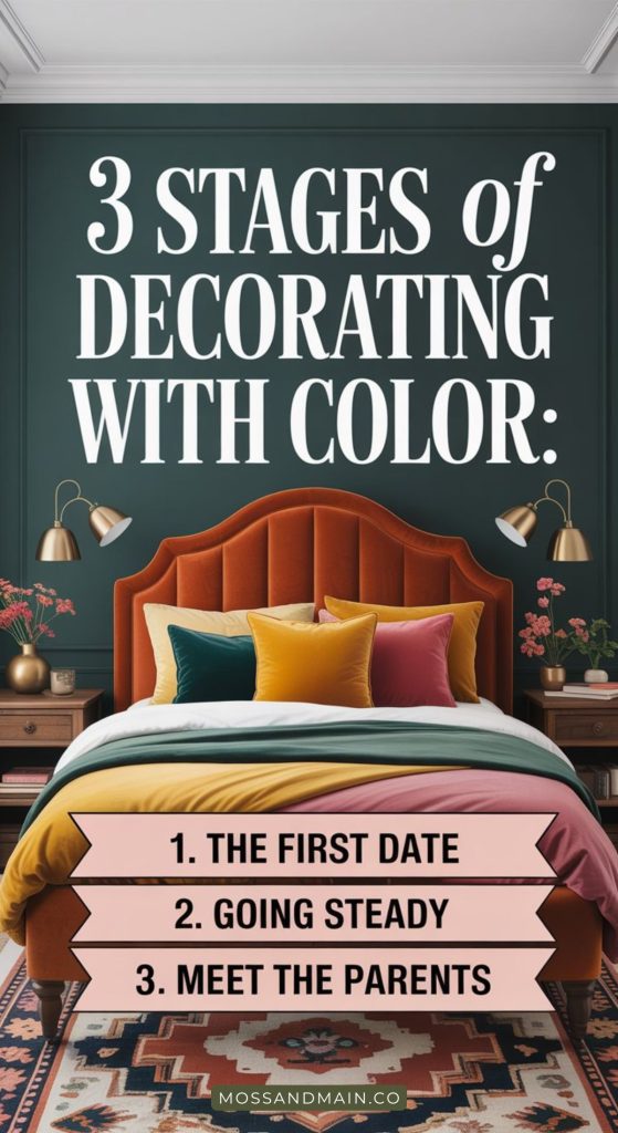
Phase 1: The “First Date” (Zero Commitment)
Think of this as the “meeting for coffee” phase. If things go south, you can be out the door in fifteen minutes with no hard feelings.
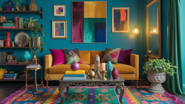
- The Power of the Throw: Textiles are the ultimate wingman. A velvet ochre pillow or a chunky terracotta throw blanket allows you to see how a color interacts with your lighting and your existing furniture. If the color feels “too loud” after a movie night, you can literally hide it in a basket.
- The “Coffee Table Method”: Use small-scale accessories like taper candles, oversized art books, or a sculptural tray. It’s a 5% infusion of color that proves you’ve got a pulse without changing the DNA of the room.
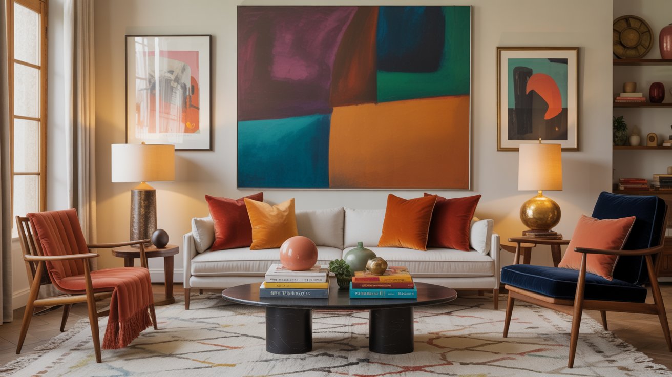
- Art as an Anchor: Find a print that features the bold color you’re flirting with. Hang it up. If you can’t stop looking at it, that’s a sign you’re ready for the next step.
Phase 2: “Going Steady” (Low-Risk Changes)
You’ve been seeing each other for a few weeks, and honestly? You’re starting to catch feelings. It’s time to move past pillows and into things that require a little more effort, but are still totally reversible.
The “Fifth Wall” Strategy: Instead of committing to four walls, try painting a single piece of furniture—like a thrifted nightstand or the inside of a bookshelf. It’s a “pop” of personality that feels intentional, not overwhelming.
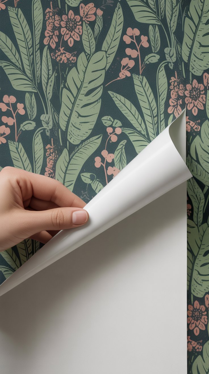
Peel-and-Stick Magic: Temporary wallpaper is so high-quality it’s basically indistinguishable from the real thing. It’s the ultimate “safety school” for decorators.
Try a bold botanical print in a hallway; if you hate it by next season, just peel it off like a giant sticker. Easy peasy!
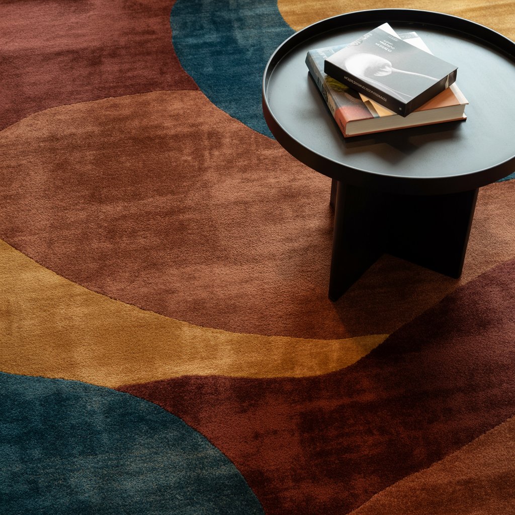
Rug Math:
A rug covers a huge amount of visual real estate. If you choose a rug with a deep, saturated hue (think: “Midnight Forest” or “Burned Umber”), the room will feel colorful even if your walls stay white.
And the best part about this option (especially for you color phobes)?
You can swap it out anytime!
Phase 3: “Meeting the Parents” (Semi-Permanent)
This is it. You’re ready to introduce this color to your lifestyle in a real way. You’re picking up a paintbrush, but we’re still playing it smart.
- The Powder Room Rule: Small, enclosed spaces are the “safe zones” of interior design. Because you don’t spend hours in there, you can go wildly bold without getting “color fatigue.” It’s the perfect place to try 2026’s “Electric Saturation” trend—think deep plums or lacquered teals.
- Color Drenching “Light”: Instead of painting the whole room, just paint the window frames or the baseboards. This “outline” effect adds architectural interest and makes the room feel high-end without the “closed-in” feeling of a dark room.
- The Modern Accent Wall: The 2026 version isn’t just a random red wall. It’s tonal. Try painting one wall two shades darker than your existing neutral. It’s sophisticated, moody, and won’t make you panic when you walk into the room.
The “Breakup” Clause (How to Avoid Regret)
Even the best relationships have red flags.
To ensure you don’t end up with decorator’s remorse, follow these three rules:
#1 | The 48-Hour Swatch Test
Never, ever buy a gallon of paint based on a tiny paper square. Always try to buy the little paint sample jars they sell at the paint store. If they don’t offer them, ask them to mix up a small quart-sized jar.
You may also be able to find extra large “peel-and-stick” paint sample, so you can just stick them on the wall.
Then, when you get home, paint a large piece of posterboard. Move it around the room. See how it looks at 8:00 AM versus 8:00 PM.
PRO TIP: You can also use cardboard for your paint testing, just make sure you give it a base coat of white paint before painting with your sample color. Otherwise, the brown cardboard color could make your paint sample look a little off.
#2 | The “Big Three” Rule
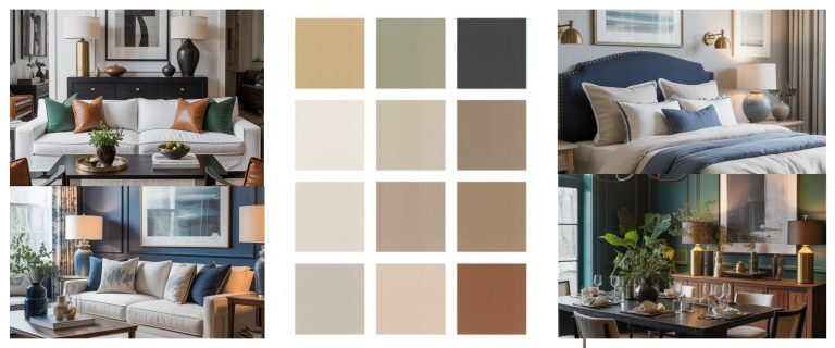
Keep your most expensive items—the sofa, the bed, the dining table—in timeless neutrals.
It is much easier (and cheaper) to “break up” with a $40 set of curtains than a $3,000 sectional sofa!
#3 | Check the Undertones
That “soft grey” you liked might have a secret purple undertone that only comes out when your LED lights are on.
Always test your colors under your actual light bulbs!
Conclusion: Happily Ever After
At the end of the day, your home shouldn’t be a museum of “Safe Choices.”
It should be a reflection of you. Decorating is a journey, not a destination, and color is just the seasoning that makes the space yours.
Don’t let the fear of a “wrong” choice keep you living in a white box. Start small, flirt a little, and remember: it’s just decor.
If you stop loving it, you can always move on to the next beautiful thing.
Please note: This website contains affiliate links. As an Amazon Associate, we earn from qualifying purchases at no additional cost to you.