Blue Dining Room Ideas: The Complete Guide to Every Shade (Dark, Light & Dusty)
Please note: This website contains affiliate links. As an Amazon Associate, we earn from qualifying purchases at no additional cost to you.
There’s a reason blue has become the it color for dining rooms right now.
It’s one of those rare shades that does everything: it feels calm and collected, but also deeply sophisticated. It can be the boldest room in your house or the most serene. And depending on which blue you choose, it can read as coastal, modern, moody, romantic, or earthy. That’s not versatility — that’s a superpower.
If you’ve been eyeing a blue dining room but can’t quite commit to a shade, this guide is for you. We’re covering the full spectrum — from inky navy and dramatic dark blue to soft sky, breezy powder blue, and that elusive dusty blue that’s quietly taking over design boards everywhere. Scroll through, find the vibe that speaks to you, and get ready to fall completely in love with your dining room.
JUMP TO: Dark Blue Dining Rooms | Light Blue Dining | Dusty Blue Dining Rooms
Why Blue Works So Well in a Dining Room
Before we get into the specific looks, let’s talk about why blue dining rooms work so beautifully in the first place — because there’s actual design logic behind the trend.
Blue is a color that encourages conversation and connection. Unlike red (which can feel stimulating to the point of anxiety) or stark white (which can feel clinical), blue creates an atmosphere that says linger here a little longer. It’s psychologically grounding, which is exactly what you want in a space built around gathering and sharing meals.
It also plays remarkably well with the things you’ll likely already have: warm wood tones, brass and gold hardware, white or cream linen, rattan textures, and natural greenery. Blue has the rare quality of making every accent color look better — it’s the perfect foil.
And from a design perspective? A blue dining room makes a statement without demanding constant trend-chasing. It’s a classic that manages to feel current. Whether you go for an all-over color-drenched approach or just a bold blue dining room accent wall, the result consistently punches above its weight.
How to Choose the Right Shade of Blue for Your Dining Room
Not all blues are created equal, and choosing the wrong one for your space is the most common mistake. Here’s how to narrow it down:
- Natural light: North-facing rooms with cooler light suit warmer blues (think dusty, earthy tones). South-facing rooms with abundant light can handle cooler, deeper blues without feeling cold.
- Room size: Lighter blues visually expand a smaller dining room; darker blues work best in larger spaces where the drama doesn’t overwhelm.
- Existing furniture: Dark wood tones pair beautifully with navy and slate. Light natural wood or rattan sings alongside powder blue and dusty blue.
- The mood you’re after: Moody and dramatic? Go dark. Airy and relaxed? Go light. Sophisticated but soft? Dusty blue is your answer.
Still deciding between warm and cool neutrals elsewhere in your home? Our guide to earthy dining room design shows how to layer tones for a cohesive, grounded look that pairs well with any blue.
Dark Blue Dining Room Ideas
Dark blue dining rooms are having a serious moment — and with good reason. Search interest in dark blue dining room walls is up over 34% year-over-year, and moody dining room ideas is up a staggering 51%. People aren’t just drawn to the aesthetic — they’re actively planning it.
If you’ve ever wanted a dining room that feels like stepping into a private members’ club or an intimate Parisian bistro, dark blue is your starting point.
Navy + Brass + Warm Wood: The Classic That Never Quits
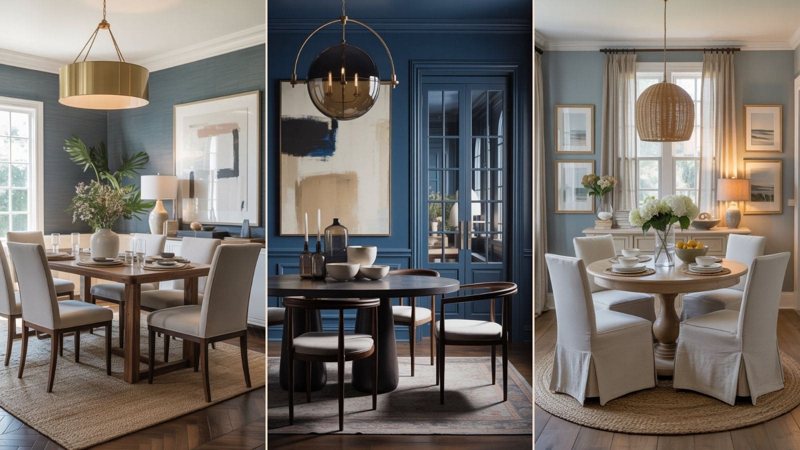
Navy is the entry point for most people venturing into dark blue territory — and there’s a reason it remains a design staple. It’s approachable but undeniably bold. The key to making it feel intentional rather than flat is the hardware: go brass. Brass sconces flanking a sideboard, a brass-rimmed chandelier, drawer pulls — the warm metal against the cool depth of navy creates instant tension and richness.
Pair navy walls with a round walnut table (the curved lines soften the weight of dark walls), cream or oatmeal upholstered dining chairs, and white linen curtains that brush the floor. The result is a room that feels like it costs significantly more than it does. For blue paint inspo, Benjamin Moore’s Hale Navy (HC-154) and Sherwin-Williams Naval (SW 6244) are the workhorses of this look.
2. Hague Blue: The Moody, Considered Alternative to Navy
If navy is the confident classic, Hague Blue is the moody intellectual. Farrow & Ball’s Hague Blue (No. 30) sits at the intersection of teal, green, and navy — a complex, shifting color that looks dramatically different depending on the light. In a dining room, it creates an almost enveloping quality that feels genuinely atmospheric.
The key to doing Hague Blue justice is to commit. Paint the walls and the trim in the same shade — a technique called color drenching — and let the room absorb the depth. Balance it with tactile, organic materials: a long oak or walnut table, velvet dining chairs in forest green or warm rust, and aged iron or unlacquered brass lighting. This is the room where dinner parties linger until midnight.
For more moody color inspo in the dining room, see how we styled our dark green dining room ideas — the same principles of depth and drama apply perfectly here.
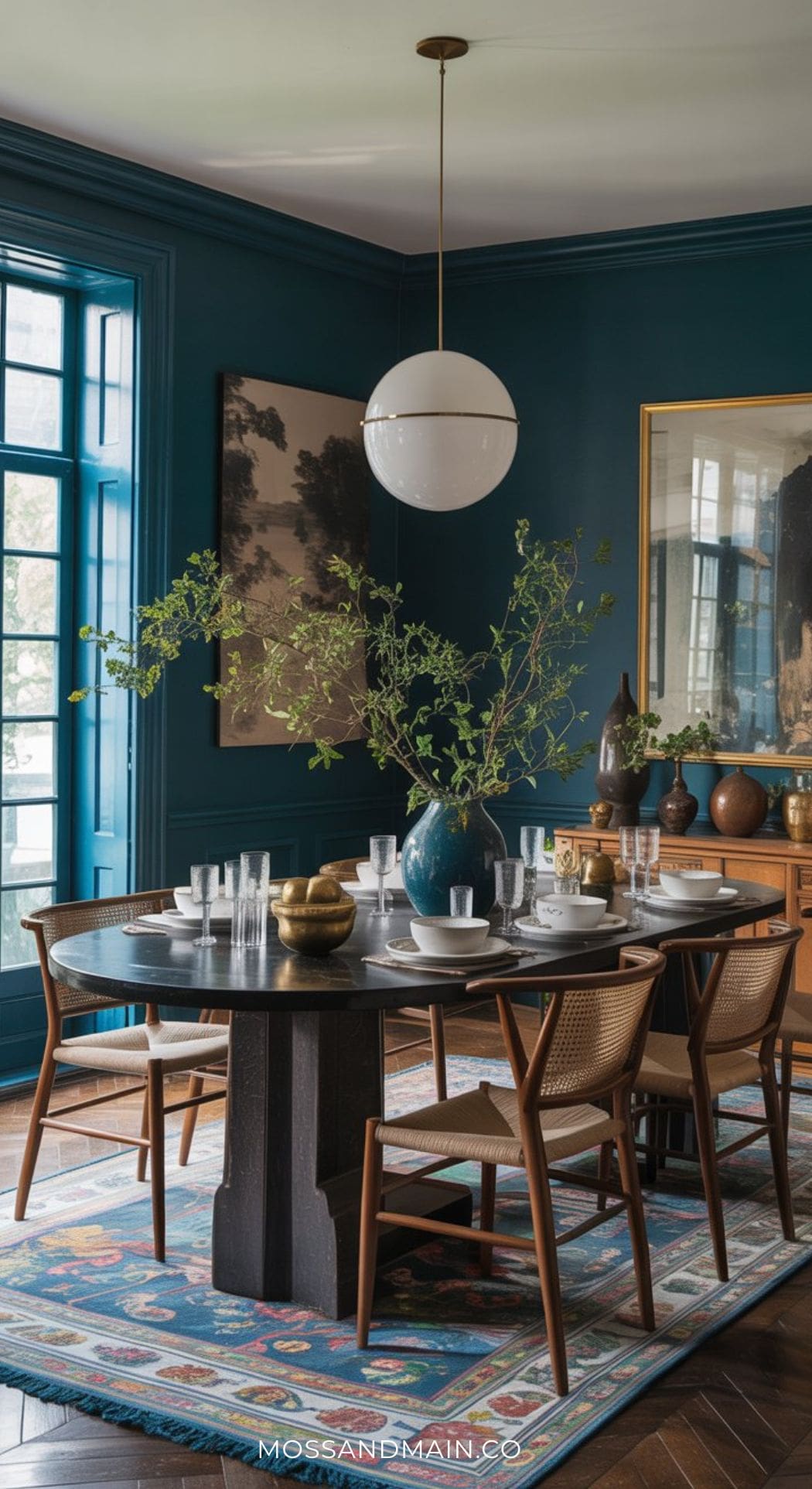
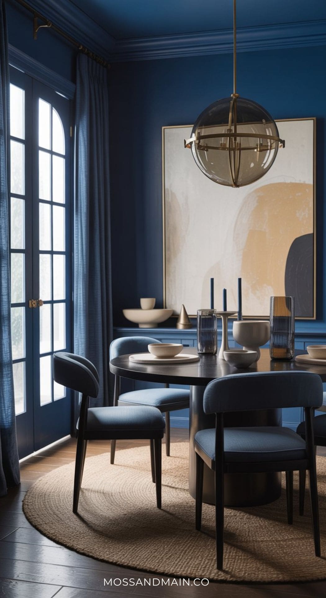
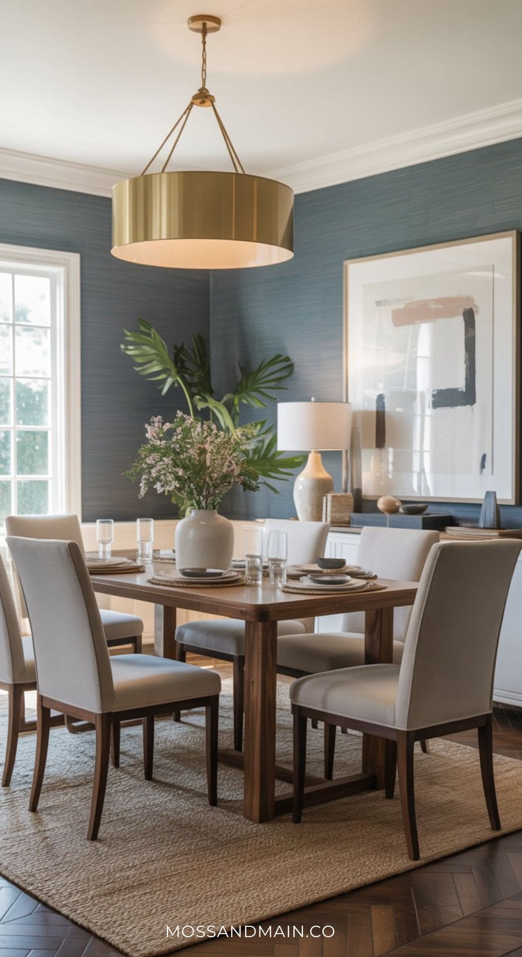
Playful Modern Blue Dining Room
This blue dining room feels clean, modern, and effortlessly warm with its rich cobalt-blue walls, sculptural brass pendant lighting, and soft natural wood furniture. The combination of creamy linen drapery, organic decor, and minimalist styling keeps the bold wall color feeling airy and approachable instead of heavy.
Between the oversized abstract artwork, warm walnut tones, and layered neutral textures, the entire space has that relaxed West Elm-inspired look that feels both elevated and livable.
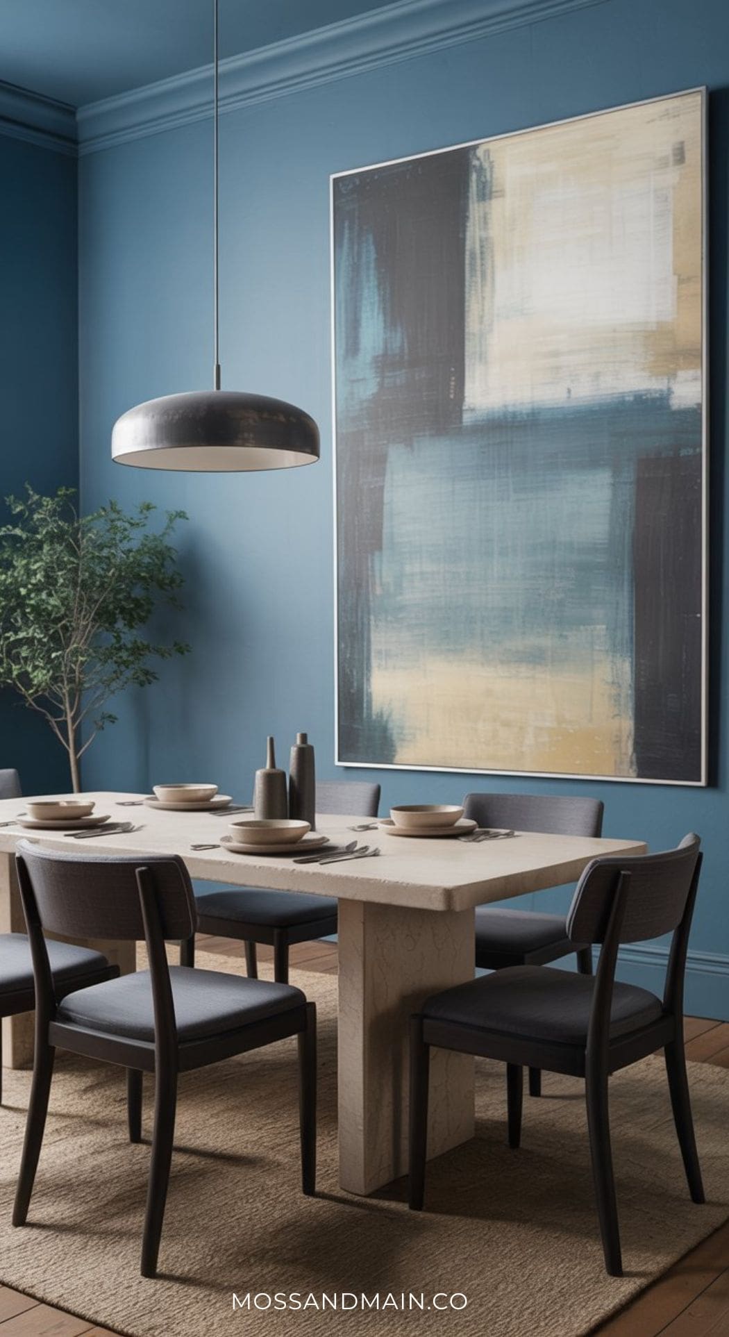
3. Dark Blue + Terracotta Accents: Unexpected and Unforgettable
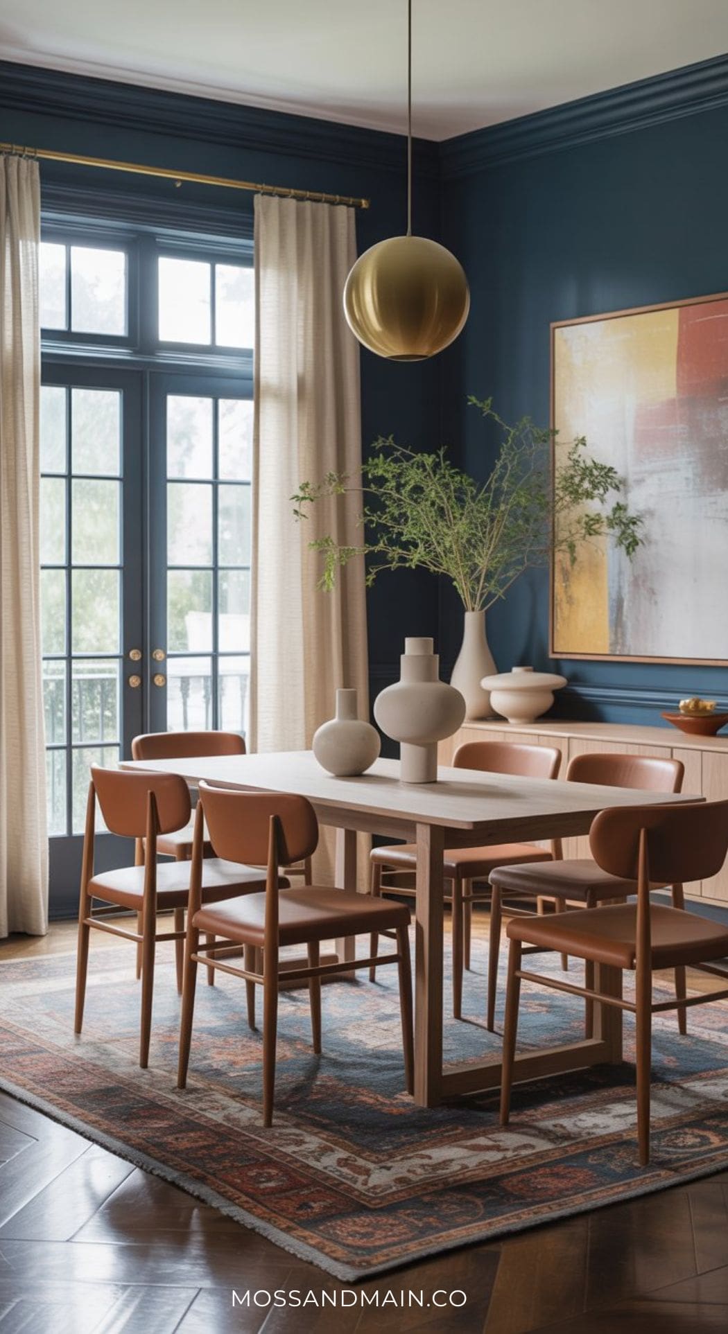
This dark blue dining room feels bold yet incredibly inviting with its dramatic inky blue walls, warm cognac-toned dining chairs, and soft natural textures layered throughout the space. The space has that polished modern-organic look that feels sophisticated without sacrificing comfort.
This is the pairing that stops people in their tracks: dark blue with terracotta. The contrast should feel like it shouldn’t work — cool versus warm, deep versus earthy — but it creates something genuinely beautiful. If you love the blue bedroom with rust and terracotta accents look we explored on the blog, this is its dining room counterpart.
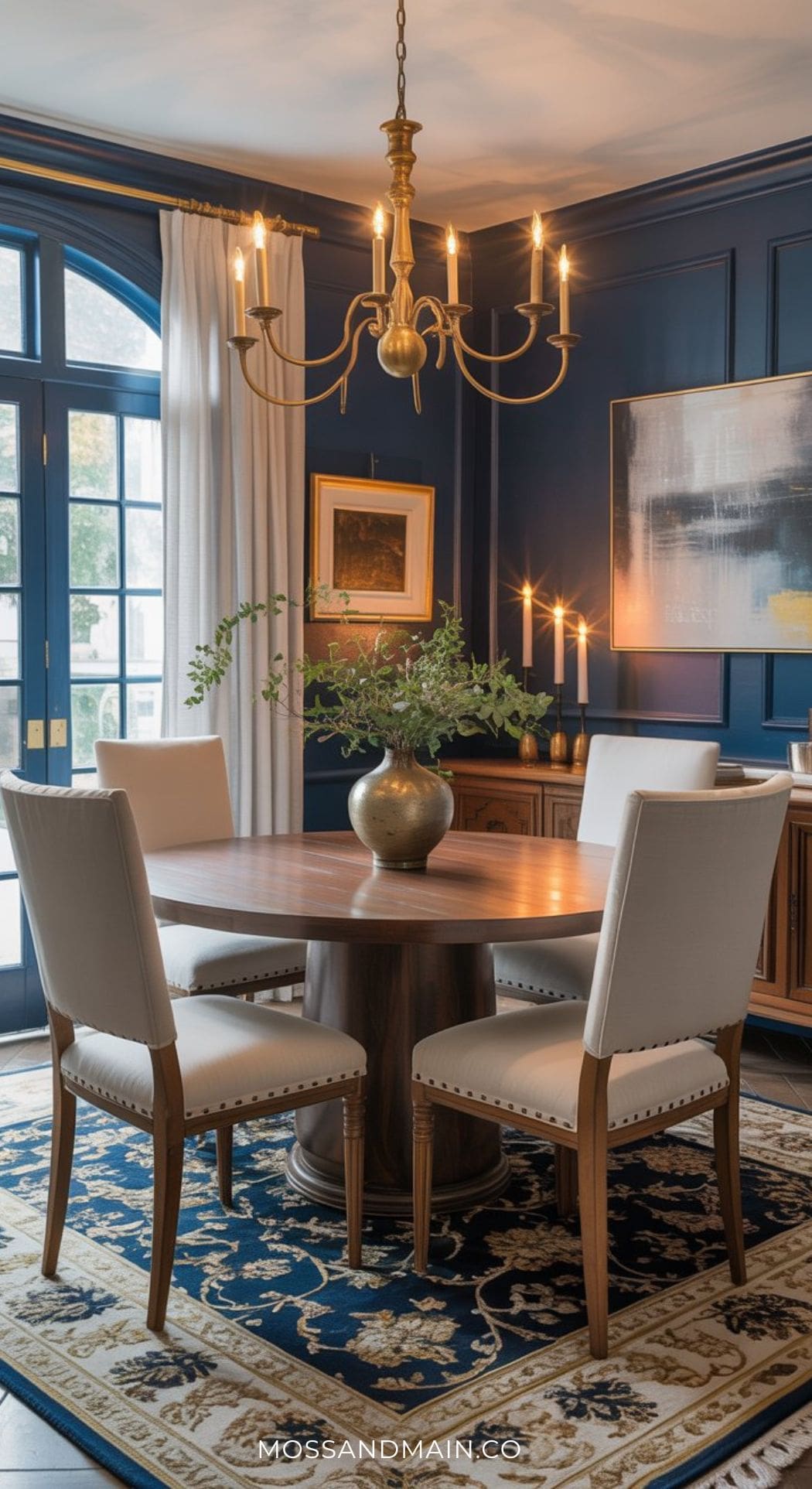
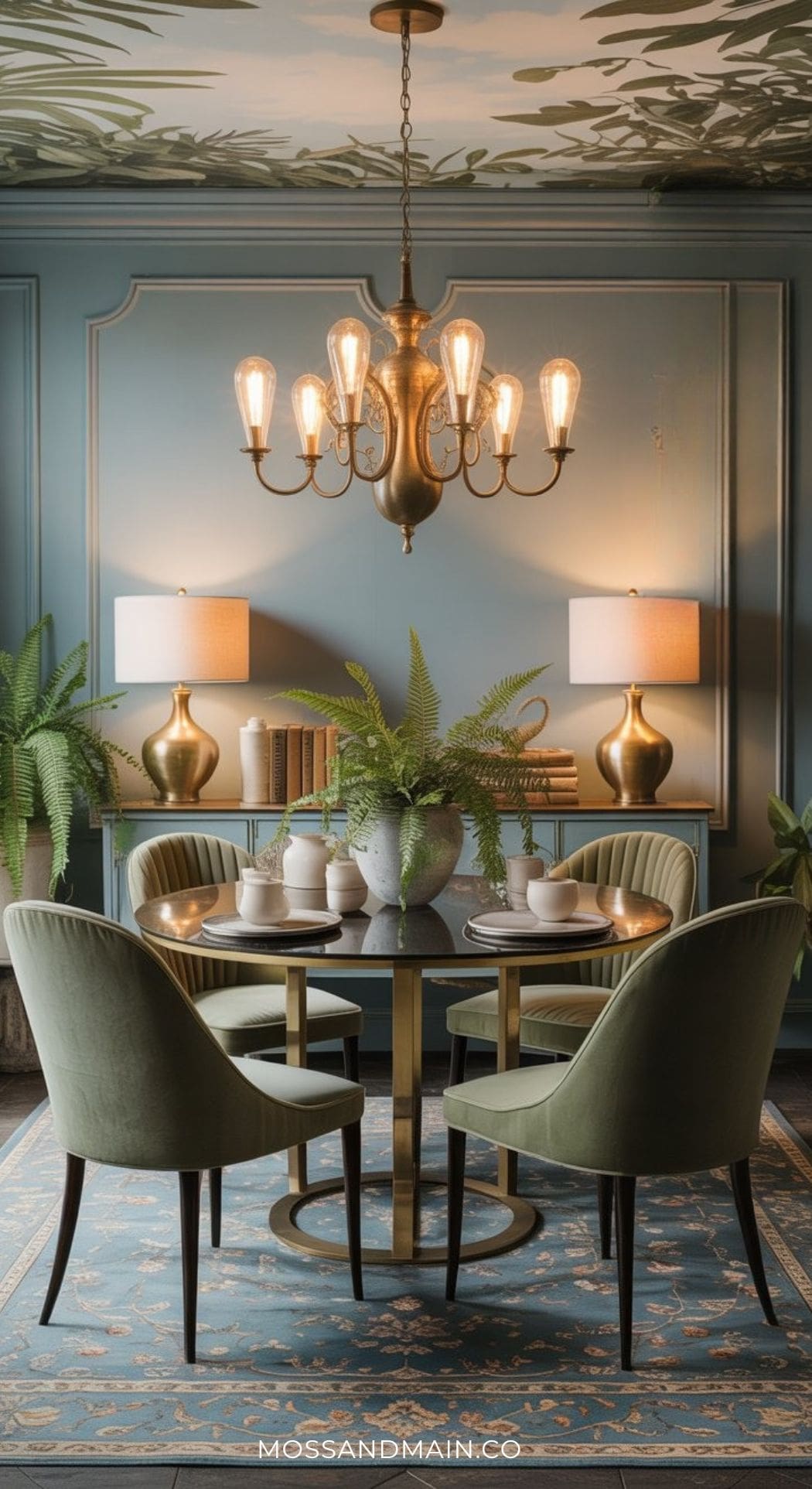
Cozy & Inviting Dark Blue Dining Room
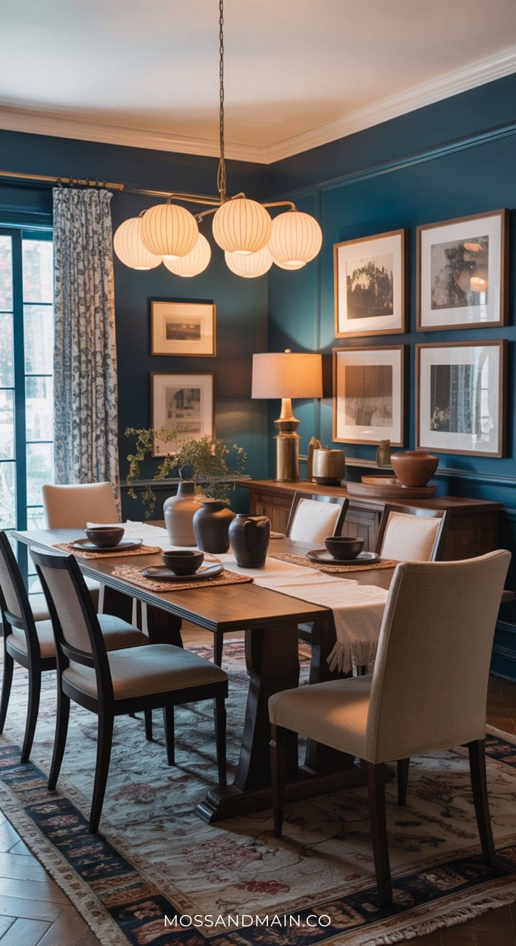
This blue dining room feels rich, cozy, and timeless with its deep moody blue walls, warm walnut furniture, layered lighting, and classic Pottery Barn-inspired styling. The creamy upholstered dining chairs soften the darker wall color beautifully, while the oversized globe chandelier and framed gallery wall add warmth and character without making the space feel overly formal.
Between the vintage-inspired rug, textured ceramics, and soft patterned drapery, the entire room feels collected, welcoming, and effortlessly designer-styled.
4. All-Over Dark Blue: The Fully Color-Drenched Dining Room
Color drenching — painting walls, ceiling, trim, and built-ins all in the same deep blue — is one of the highest-commitment, highest-reward moves in interior design. It creates a jewel-box effect that’s genuinely immersive, and in a dining room, it makes every meal feel like an event.
Want more dark blue inspiration? We have it covered! Explore 20+ more moody and dark blue dining room designs.
Light Blue Dining Room Ideas
Light blue dining rooms occupy a completely different emotional register than their darker counterparts — breezy, open, effortlessly livable. This is the palette for spaces flooded with natural light, for people who want their dining room to feel like a Sunday morning rather than a Thursday evening dinner party. It’s serene without being boring, and it pairs beautifully with natural textures and organic shapes.
5. Powder Blue + Rattan + Linen: Relaxed Coastal Chic
Powder blue is the Goldilocks of light blues — not so pale it disappears, not so vivid it dominates. In a dining room, it creates an instant sense of ease. Pair it with white wainscoting for a classic detail that grounds the space, then layer in rattan chairs and linen textiles for the relaxed, organic texture that defines this look.
This is also the shade that works beautifully with a blue and white dining room approach: keep the dishes, linens, and ceramics in white and blue patterned pieces, and the whole room takes on a fresh, considered quality that feels effortlessly collected rather than matchy.
For styling the table in this kind of space, our organic dining room decor ideas guide is full of simple, beautiful approaches to natural centerpieces that complement this palette perfectly.
6. Sky Blue Dining Room Walls with a Warm Wood Statement Table
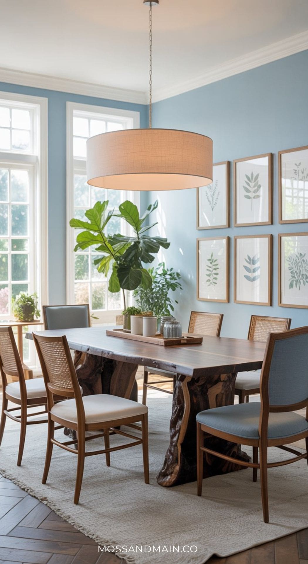
One of the most effective ways to prevent a light blue dining room from reading as cold is to anchor it with a dramatic warm wood element. A live-edge walnut table — with all its organic grain and warmth — does exactly that. The contrast between the cool sky blue and the rich amber of walnut is one of those combinations that feels both unexpected and completely right.
Mix your seating here: alternate between upholstered chairs in a slightly deeper blue and cream or natural linen for a collected, curated feel. Indoor plants bring in green as a third natural tone that bridges sky blue and warm wood beautifully.
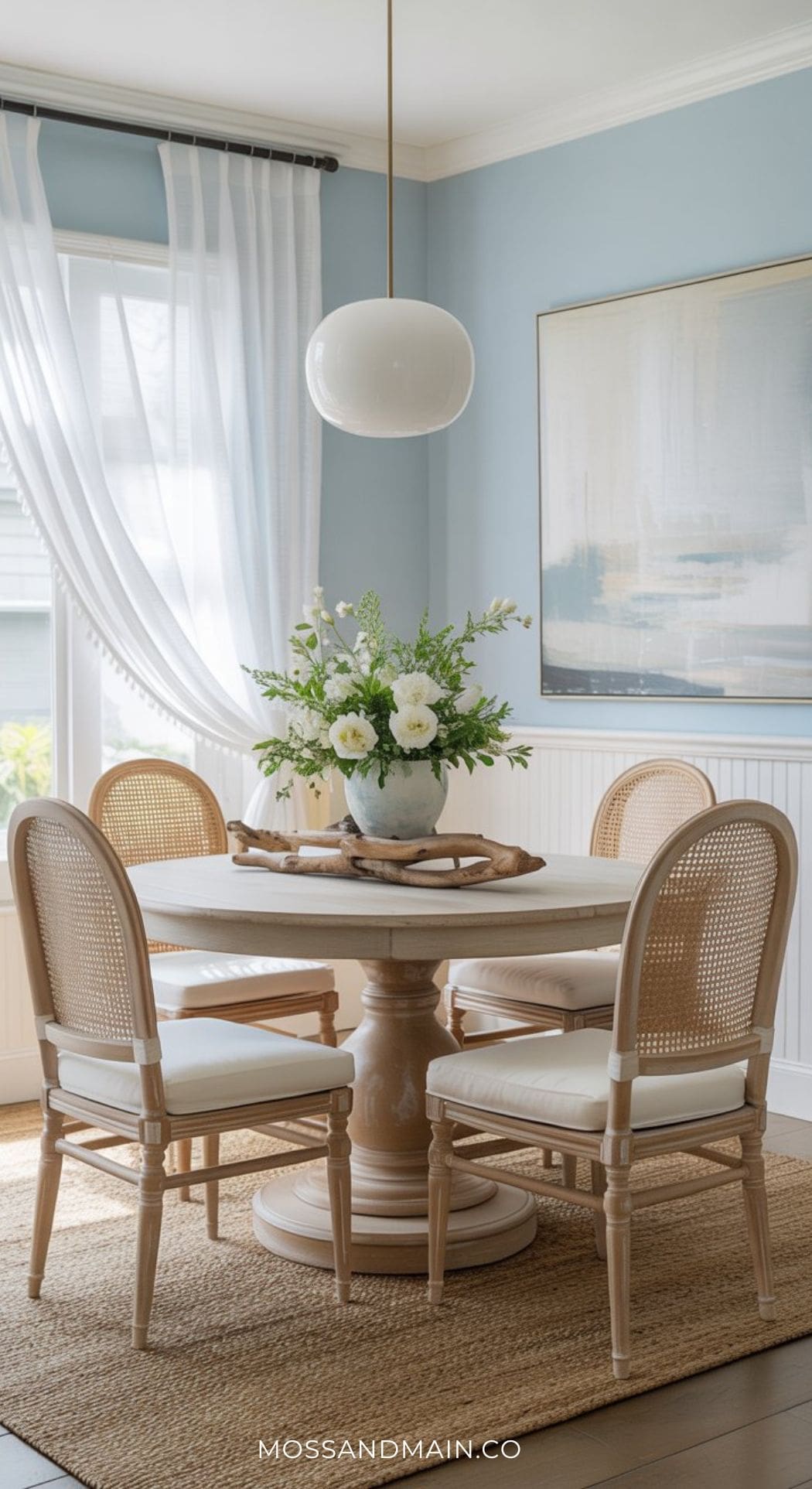
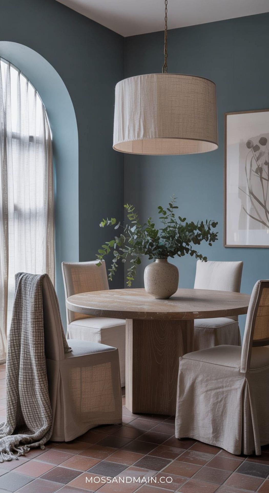
Soft Coastal Blue Dining Room
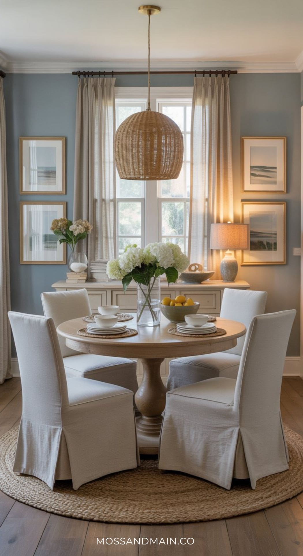
This soft coastal blue dining room feels airy, relaxed, and effortlessly timeless with its pale dusty blue walls, woven pendant lighting, and creamy slipcovered dining chairs. The layered natural textures, warm wood pedestal table, and soft neutral styling create a cozy atmosphere that feels both elegant and approachable. Between the oversized hydrangeas, woven rug, and light coastal artwork, the entire space has that calm Serena & Lily-inspired look that makes the room feel instantly welcoming.
Duck Egg Blue Dining Room: The Vintage-Inspired, Endlessly Elegant Choice
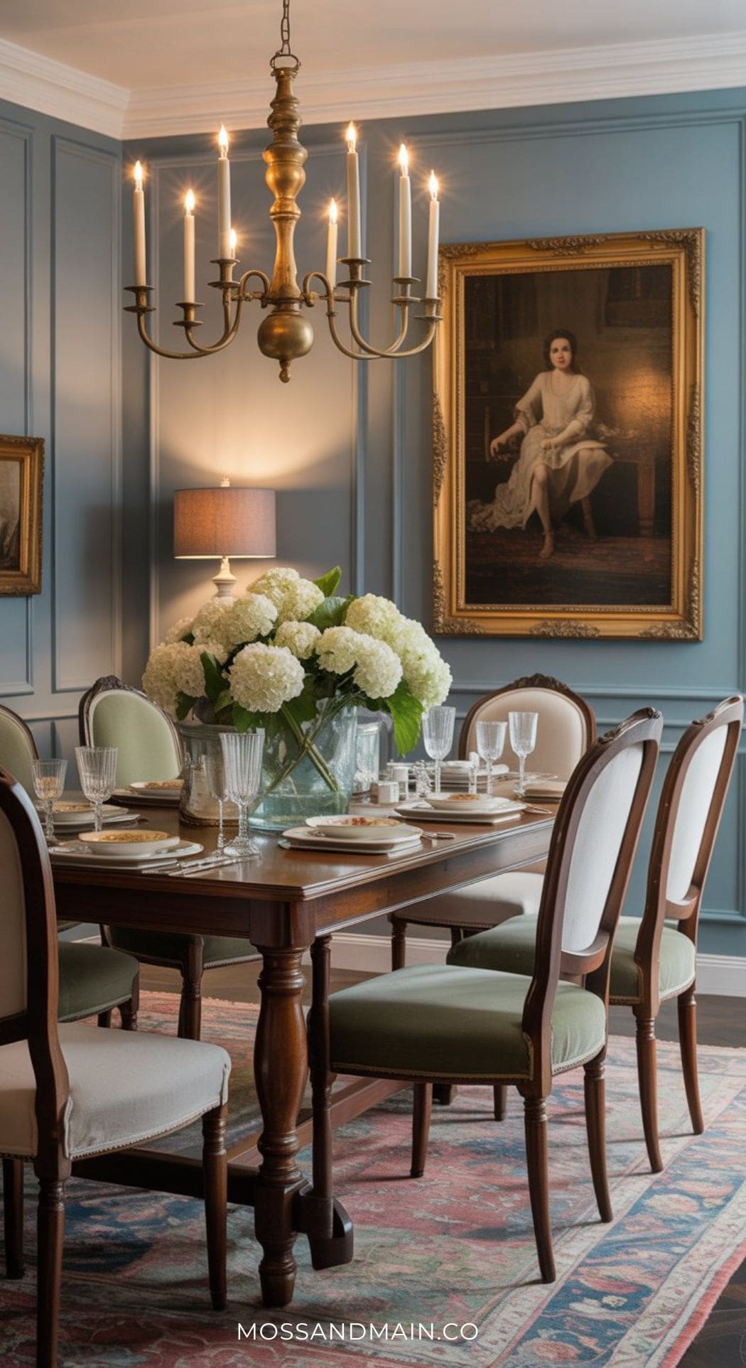
Duck egg blue is the shade that feels like it belongs in a centuries-old country house — or a perfectly styled modern farmhouse that’s been around long enough to have stories. It sits at the intersection of blue and green, with a slightly mineral, almost chalky quality that pairs beautifully with aged antique furniture, gilded details, and ornate lighting.
If you love a room with layers of history and character, duck egg blue dining rooms are your calling. Mix antique and modern pieces: an old mahogany table with contemporary velvet chairs, a grand chandelier with simple white tableware. The blue serves as the connective tissue that makes the mix feel intentional.
Baby Blue Dining Room + White Shiplap + Black Accents: Modern Farmhouse Fresh
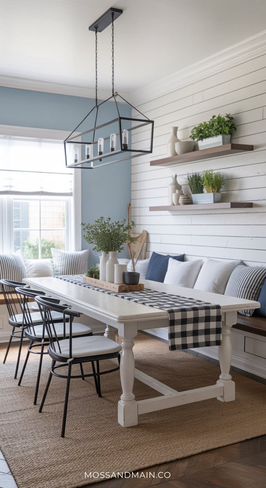
Baby blue is the lightest, most delicate entry into the blue dining room world — and it works beautifully in a modern farmhouse setting where the lightness of the color prevents the aesthetic from feeling overly rustic. The formula here is simple: baby blue walls, crisp white shiplap or board-and-batten detail, and black metal accents to sharpen the whole thing up.
The black keeps baby blue from drifting into nursery territory — it’s the edit that makes the color feel grown-up and intentional.
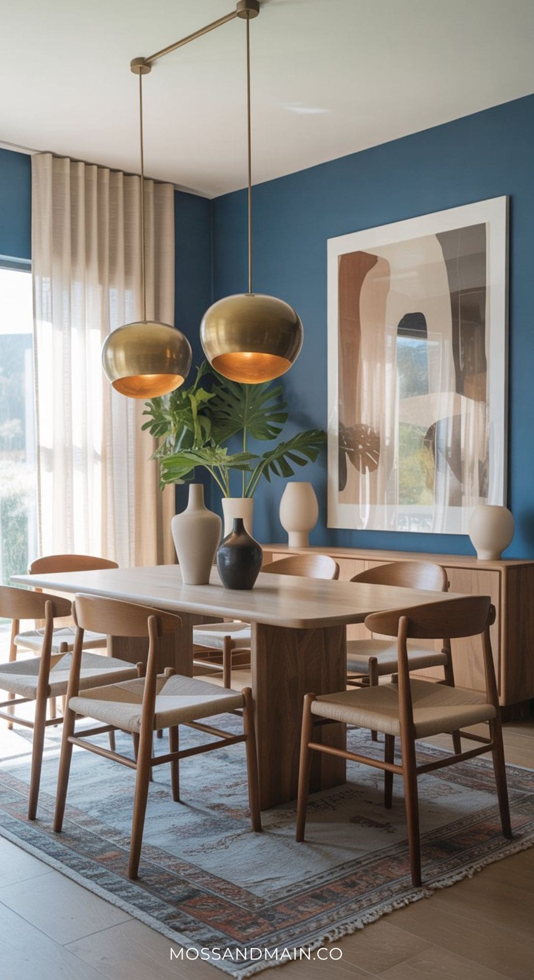
Light Blue Mid-Century Modern Dining Room
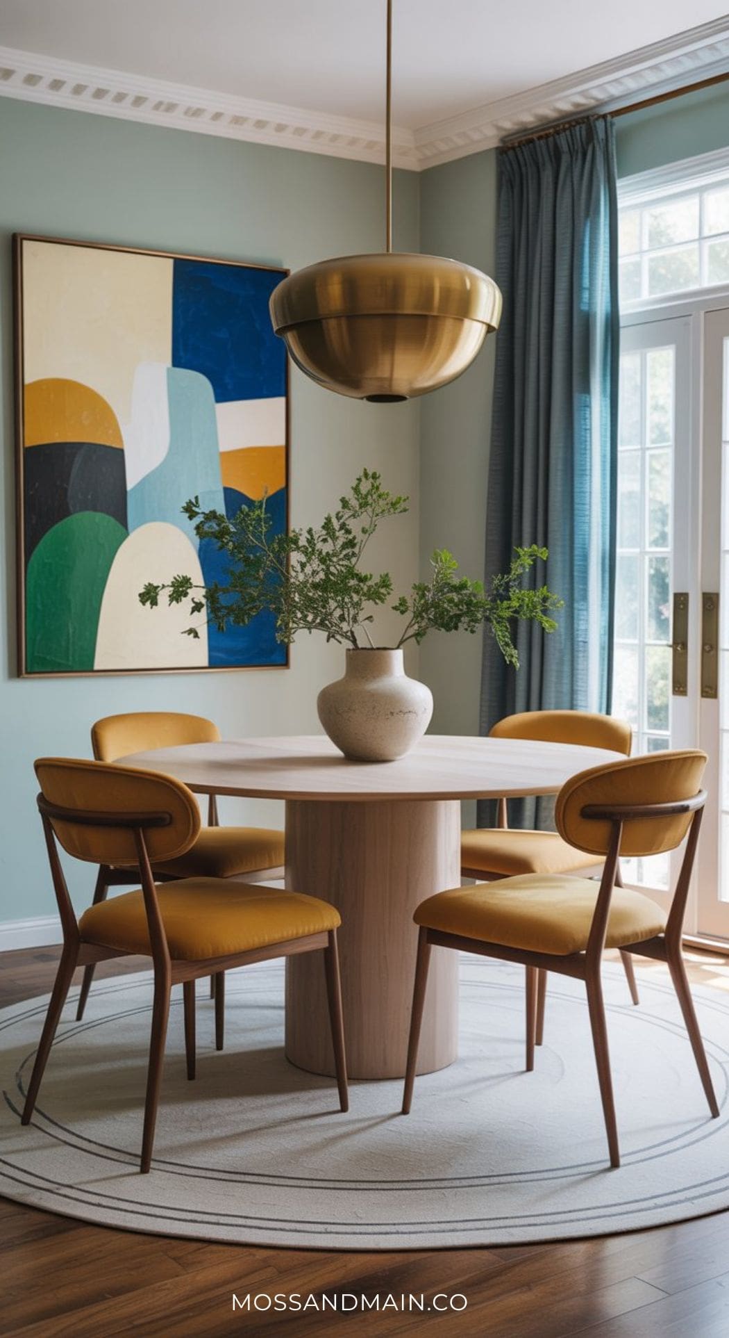
Light blue dining rooms don’t always have to be coastal or vintage! This light blue mid-century modern dining room feels clean, artistic, and effortlessly sophisticated with its soft muted blue walls, sculptural brass pendant lighting, and warm caramel leather dining chairs. The rounded pedestal table and oversized abstract artwork give the space a bold modern personality, while the layered neutral textures and natural wood tones keep the room feeling warm and approachable.
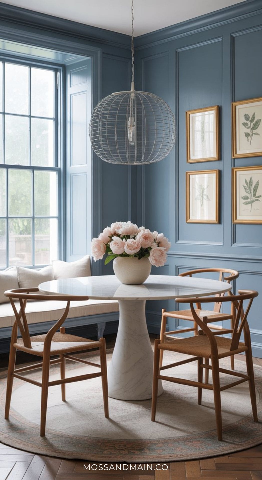
Dusty Blue Dining Room Ideas
Dusty blue is the most nuanced, most quietly sophisticated shade in the blue family — and it’s emerging fast. Unlike the clarity of navy or the brightness of sky blue, dusty blue has a slightly muted, almost weathered quality. It reads as effortlessly cultivated, the shade that makes a room look like it was styled by someone who spent years living in the South of France. It’s soft without being sweet, and it pairs remarkably well with warm organic materials.
Elegant + Simple Dusty Blue Dining Room
This dusty blue dining room feels calm, polished, and effortlessly timeless with its soft blue textured walls, warm walnut dining table, oversized brass drum pendant, and creamy upholstered dining chairs. The mix of warm wood tones, layered neutrals, and subtle blue hues creates a cozy designer-inspired space that feels elevated without being overly formal. It’s the kind of dining room that feels equally perfect for slow morning coffee or hosting friends for dinner.
Dusty Blue Dining Room Walls + Warm Oak + Linen: The Quiet Luxury Room
The dusty blue and warm oak combination is the definition of quiet luxury — understated, material-rich, and deeply considered. Dusty blue walls recede gently, creating a backdrop that makes the warmth of natural wood sing. Linen slipcovers in oat or warm cream add softness, while a cluster of linen pendant shades keeps the lighting intimate and warm.
This is the dining room that doesn’t announce itself — it reveals itself slowly. Every material choice has texture and intention. It’s the aesthetic of someone who knows what they like and doesn’t need to prove it.
10. Slate Blue + Charcoal + Natural Stone: The Sophisticated Minimalist
Slate blue occupies the cooler, greyer end of the dusty blue spectrum — and paired with charcoal and natural stone, it creates a dining room of genuine architectural weight. This is the palette for those who love the clean-lined restraint of Scandinavian or Japanese-influenced design: no unnecessary detail, every element chosen deliberately.
The concrete or stone dining table is the hero piece here — substantial, textural, and permanent-feeling. Matte black accents throughout (pendant light, cutlery, hardware) sharpen the palette without adding warmth, keeping the space cool, composed, and quietly impressive.
11. Gray-Blue + Sage Green: The Designer Trio
Gray-blue, warm brass, and sage green is one of those rare three-way color combinations where everything amplifies everything else. The gray-blue reads as calm and grounded; the brass brings a warmth and age that elevates the palette from trendy to timeless; the sage green adds a note of organic life that keeps the room from feeling precious.
This combination works especially well with pattern layering — a botanical print on the ceiling or an oversized vintage rug brings together all three tones and adds depth. The Nancy Meyers dining room aesthetic — collected, warm, timeless — translates beautifully into this palette.
12. Dusty Blue Paneled Walls: The Detail That Changes Everything
If you want to take your dusty blue dining room from good to genuinely extraordinary, add paneling. Full-height wall paneling — painted in the same dusty blue as the walls, in a chalky matte finish — creates an architectural quality that elevates the entire space. It’s the detail that makes people ask who your designer is.
The paneling technique works particularly well in older homes with existing period detail, but it looks just as considered in a contemporary space. Pair it with a marble table for contrast, simple organic-form chairs, and soft botanical artwork. The result is a dining room that feels endlessly refined. For more on bringing architectural detail and texture into your home, see our rustic dining room ideas for inspiration.
Blue Dining Room Color Schemes: What Works Best
Choosing your shade of blue is step one. Step two is figuring out what lives alongside it. Here are the most successful color scheme pairings for blue dining rooms:
- Blue + White: The most classic pairing. White trim, white ceiling, and white tableware keep the blue from feeling heavy.
- Blue + Warm Wood: Walnut, oak, and teak tones add the warmth that blue walls naturally lack. Essential in darker shades.
- Blue + Brass/Gold: Brass hardware, pendant lights, and mirror frames are the fastest way to make blue feel luxurious.
- Blue + Terracotta: Unexpected but exceptional. The warm earth tones of terracotta balance the cool depth of blue beautifully.
- Blue + Sage Green: Nature’s own pairing. These two organic tones sit next to each other in the natural world for a reason.
- Blue + Cream/Linen: Softer and more forgiving than stark white. Cream and linen tones warm up blue without competing with it.
The Best Paint Colors for Your Blue Dining Room: Designer Picks
The right blue paint depends entirely on which shade family you’re working in. Here are our top 5 picks for each — dark, light, and dusty — with notes on undertones and best pairings.
🌑 Dark Blue — 5 Best Paint Colors
Moody, dramatic, and deeply sophisticated
| Hale Navy HC-154 Benjamin Moore The gold standard navy. Warm undertones make it livable — pairs beautifully with brass and walnut. | |
| Naval SW 6244 Sherwin-Williams Deep, inky, and slightly cooler than Hale Navy. Exceptional for color-drenched rooms. | |
| Hague Blue No. 30 Farrow & Ball Complex teal-navy with green undertones. Shifts dramatically in different light — moody and unforgettable. | |
| Stiffkey Blue No. 281 Farrow & Ball Almost blue-black in low light. Ideal for the fully color-drenched dining room look. | |
| Van Deusen Blue HC-156 Benjamin Moore Sits between navy and mid-blue — versatile enough for both dramatic and approachable dark rooms. |
☀️ Light Blue — 5 Best Paint Colors
Breezy, airy, and effortlessly livable
| Iceberg 2122-50 Benjamin Moore A clean, confident powder blue with just enough depth to read as intentional, not washed out. | |
| Upward SW 6239 Sherwin-Williams A fresh sky blue that leans slightly warm — prevents the cold feeling common in lighter blues. | |
| Lulworth Blue No. 89 Farrow & Ball Soft, chalky, and coastal. The perfect light blue for a rattan-and-linen aesthetic. | |
| Watery No. 204 Farrow & Ball A delicate mineral blue-green. Ethereal in morning light — beautiful with white and natural oak. | |
| Honest Blue SW 6B19 Sherwin-Williams A reliable mid-light blue with balanced undertones — works equally well with warm and cool furniture. |
🌫️ Dusty / Medium Blue — 5 Best Paint Colors
Muted, nuanced, and quietly sophisticated
| Dusty Miller 2112-40 Benjamin Moore The quintessential dusty blue. Reads differently at every hour of the day — endlessly nuanced. | |
| Smoky Blue SW 6327 Sherwin-Williams A calm, weathered blue with prominent grey undertones. Effortlessly sophisticated with warm wood and brass. | |
| Mizzle No. 266 Farrow & Ball A green-leaning dusty blue — earthy and mineral. Stunning paired with sage green accents and terracotta. | |
| Stone Blue No. 86 Farrow & Ball A historical F&B shade — deeply complex and timeless. The go-to for paneled dusty blue dining rooms. | |
| Poolhouse SW 9551 Sherwin-Williams A cooler, slate-leaning dusty blue. Ideal for the minimalist or Scandinavian-inspired dining room. |
Frequently Asked Questions
What is the best shade of blue for a dining room?
The best shade depends on your room’s light and your personal style. For a moody, dramatic look, go with navy or Hague Blue. For a fresh, airy feel, powder blue or sky blue work beautifully. For quiet sophistication, dusty or slate blue is the most nuanced option. When in doubt, test several paint samples on your wall and observe them at different times of day before committing.
Do blue dining rooms make a room look smaller?
Darker blues can make a room feel more intimate (which is often desirable in a dining room), while lighter blues can expand a space visually. If you have a smaller dining room, opt for a soft powder blue or sky blue rather than a deep navy or Hague Blue. Alternatively, use dark blue strategically — on just one accent wall, or below a chair rail — to get the drama without the compression.
What colors go with blue dining room walls?
Blue is one of the most versatile backdrop colors in interior design. It pairs beautifully with white and cream (classic), warm wood tones (essential for balance), brass and gold hardware (for a luxurious feel), terracotta and burnt orange accents (for warmth and contrast), sage green (for a natural, organic feel), and blush pink (for something softer and more romantic).
Is a blue dining room a good idea?
Absolutely — blue is consistently one of the top-performing dining room colors for a reason. It creates an atmosphere that encourages people to relax and linger, pairs well with almost every furniture style, and photographs beautifully. The key is choosing the right shade and pairing it with warm-toned accents to prevent the room from reading as cold.
What is the most popular blue paint for dining rooms?
Some of the most consistently recommended shades include: Benjamin Moore Hale Navy (HC-154), Sherwin-Williams Naval (SW 6244), Farrow & Ball Hague Blue (No. 30), Benjamin Moore Van Deusen Blue (HC-156) for mid-tones, and Farrow & Ball Lulworth Blue (No. 89) for a beautiful dusty option.
Ready to Go Blue?
Whether you’re drawn to the moody drama of a fully drenched navy room or the quiet elegance of a dusty blue paneled space, there’s a blue dining room that was essentially made for you. The secret is in the details — the right shade, the right warm counterbalances, and the patience to let the layers of the room come together.
Please note: This website contains affiliate links. As an Amazon Associate, we earn from qualifying purchases at no additional cost to you.