Calming Bedroom Colors | Bedroom Color Schemes for Better Sleep
Please note: This website contains affiliate links. As an Amazon Associate, we earn from qualifying purchases at no additional cost to you.
Your bedroom should feel like an exhale.
But if your space feels restless, overly bright, or visually busy, bedroom paint color is often the reason — even if you can’t quite put your finger on it. Designers approach bedroom color combinations very differently than other rooms. This isn’t a space for energy or visual impact. It’s about calm, softness, and ease.
The calming bedroom colors below are designer-approved bedroom color schemes that consistently support better sleep by reducing visual stimulation and creating a grounded, peaceful atmosphere.
Each palette includes real bedroom paint colors and bedroom wall color ideas you can start with — no guessing required.

We know you probably want to jump right into the calming bedroom ideas, but if want to get into the psychology of calming paint colors, please be sure to read to the end of the article.
Soft Warm White + Light Beige

A Calm Bedroom Color Palette Without Feeling Cold
Bright white bedrooms can feel stark at night, especially under artificial lighting. Designers often choose soft, warm whites instead, pairing them with light beige or cream to create a calming bedroom color scheme that still feels light and breathable.
This approach works especially well if you want a neutral look but still want your bedroom to feel cozy rather than clinical.

Designer-approved bedroom paint colors to try:
- Sherwin-Williams Alabaster (SW 7008)
- Benjamin Moore White Dove (OC-17)
Pair with these bedroom wall colors:
- Sherwin-Williams Accessible Beige (SW 7036)
- Benjamin Moore Edgecomb Gray (HC-173)
Why it works:
Warm whites reduce contrast and visual tension, helping the bedroom feel settled instead of sharp — an important factor in creating a relaxing bedroom.
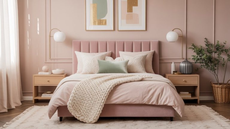
SIDE NOTE: If you love color, you can add a few pops of color to your room and it should still feel relaxing and calm. Here’s a quick example of a white bedroom with a few subtle sage green accents…

Muted Greige + Cream Color Combination

Balanced and Restful Bedroom Color Scheme
Greige is one of the most reliable bedroom wall colors because it sits between warm and cool. It never overstimulates, but it also never feels flat. Designers often recommend greige for bedrooms that get mixed lighting throughout the day.

Paired with cream or soft white, this creates one of the most dependable calming bedroom color palettes.
Designer-approved bedroom paint colors to try:
- Sherwin-Williams Agreeable Gray (SW 7029)
- Benjamin Moore Pale Oak (OC-20)
Pair with:
- Sherwin-Williams Shoji White (SW 7042)
- Benjamin Moore Simply White (OC-117)
Why it works:
Greige absorbs light gently and adapts well from day to night, making it ideal for a relaxing bedroom color scheme.
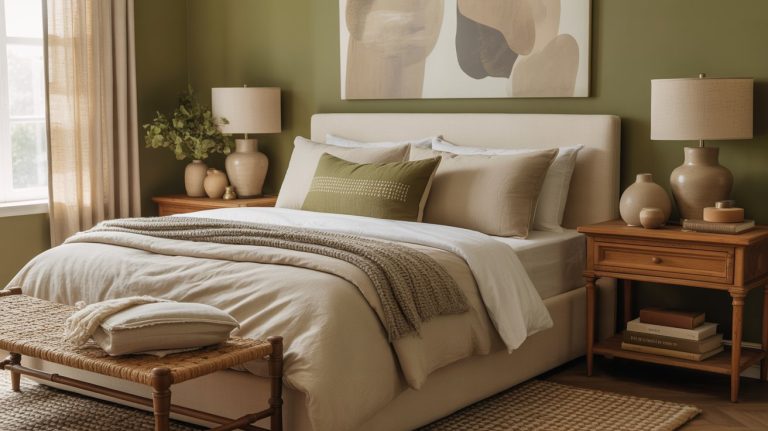
Soft Sage Green + Warm White

Nature-Inspired Calming Bedroom Colors
Muted green is a long-standing designer favorite for calming bedroom colors. It behaves like a neutral while still adding life, and it tends to feel especially soothing in the evening.
This palette is perfect if you want color without visual noise.

Designer-approved bedroom paint colors to try:
Pair with:
- Sherwin-Williams Alabaster (SW 7008)
- Benjamin Moore White Dove (OC-17)
Why it works:
Green is strongly associated with balance and restoration, making it one of the most recommended calming paint colors for bedroom walls.

Dusty Blue + Soft Neutral Color Combo

Quiet and Cooling Bedroom Color Ideas
Blue can be incredibly calming — when it’s muted. Designers avoid bright or icy blues in bedrooms and instead lean into dusty, gray-blue tones that feel soft and quiet.
This palette works especially well in bedrooms that get a lot of daylight or tend to feel warm.

Designer-approved bedroom paint colors to try:
- Sherwin-Williams Sleepy Blue (SW 6225)
- Benjamin Moore Boothbay Gray (HC-165)
Pair with:
- Sherwin-Williams Creamy (SW 7012)
- Benjamin Moore Swiss Coffee (OC-45)
Why it works:
Muted blues reduce visual stimulation and create a cooling effect, supporting a more relaxing bedroom environment.
Taupe + Soft Linen Tones

Grounded, Cozy Bedroom Wall Color Ideas
Taupe is deeper than beige but softer than gray, making it ideal for bedrooms that should feel cocoon-like. Designers often use taupe when a space needs warmth without heaviness.
This palette is especially effective for bedrooms that feel too open or exposed.

Designer-approved bedroom paint colors to try:
- Sherwin-Williams Perfect Greige (SW 6073)
- Benjamin Moore Revere Pewter (HC-172)
Pair with:
- Sherwin-Williams Shoji White (SW 7042)
- Benjamin Moore White Sand (OC-10)
Why it works:
Taupe absorbs light gently, helping the bedroom feel quieter and more grounded — key for calming bedroom colors.
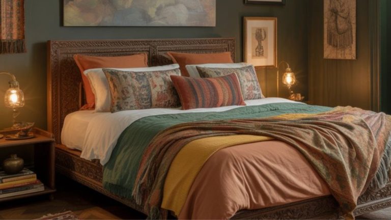
Deep Charcoal + Soft Black + Warm Taupe

Dark, Cocooning Bedroom Colors for Better Sleep
Dark bedrooms can be excellent for sleep when done correctly. Deep charcoal and soft black reduce light reflection and visual stimulation, which helps signal the brain that it’s time to rest.

Warm taupe and linen tones keep the space from feeling cold or dramatic.
Why it works: Low-contrast, dark bedroom wall colors create a protective, enclosed feeling that supports deeper relaxation.
Ink Blue + Warm Neutrals

Relaxing Bedroom Color Scheme With a Hotel-Like Feel
Ink blue is one of the best dark tones for sleep because it feels deep without being harsh. When paired with warm whites and soft wood tones, it creates a hushed, grounded bedroom.
Recommended paint colors:
- Sherwin-Williams Naval (SW 6244)
- Benjamin Moore Hale Navy (HC-154)
- Farrow & Ball Inchyra Blue (No. 289)
Why it works: Dark blues reduce visual noise and promote emotional calm, making them ideal relaxing bedroom colors.
Forest Green + Soft Linen Neutrals

Earthy, Calming Bedroom Color Palette
Forest green feels grounding and protective, especially in bedrooms with limited light. Paired with linen, oat, and warm wood tones, it creates a deeply restful space without feeling heavy.
Recommended paint colors:
- Sherwin-Williams Pewter Green (SW 6208)
- Benjamin Moore Essex Green (HC-188)
- Farrow & Ball Studio Green (No. 93)
Why it works:
Earth-toned greens support emotional balance and reduce overstimulation.
Deep Brown + Soft Taupe + Warm Cream

Ultra-Cozy Bedroom Colors for Rest
Deep brown bedrooms are often overlooked, but they’re incredibly effective for sleep. Brown absorbs light gently and feels naturally comforting when layered with taupe and cream.
Recommended paint colors:
- Sherwin-Williams Urbane Bronze (SW 7048)
- Benjamin Moore Pashmina (AF-100)
- Farrow & Ball London Clay (No. 244)
Why it works:
Low contrast and warm undertones create a seamless, calming environment.
If you love the dark brown look, you can get more inspo here: 21 Black And Brown Bedroom Designs: the Ultimate Power Couple
Why These Bedroom Color Schemes Support Better Sleep
Backed by Psychology & Real-World Data
Research in color psychology and sleep environments suggests that calming bedroom colors can influence how the brain and body wind down at night. Studies show that cool, muted colors like blues and greens reduce stress and physical arousal, while neutral tones reduce visual stimulation.
In surveys of sleep habits, 38% of people reported improved sleep quality after changing their bedroom color, reinforcing that environment plays a meaningful role in rest.
Dark, low-contrast palettes are also associated with feelings of serenity and emotional calm — both essential for sleep.
Based on the research, there are a few key ideas behind this:
Calming Colors Can Promote Relaxation
Studies indicate that cool, soft colors like blues and greens have a calming effect on the nervous system and can reduce stress and physical arousal, which helps the body prepare for sleep. This is one reason blue hues — especially softer blues — are often recommended for bedrooms.
Neutral Tones Help Reduce Visual Stimulation
Neutral tones like warm whites, greige, taupe, and beige create a non-stimulating backdrop that helps the eye rest rather than constantly “read” new visual information. Research in interior color and mood shows that overly bright or highly saturated colors can increase arousal and make relaxation harder.
Dark and Deep Tones Can Enhance Feelings of Serenity
Some research suggests that darker tones can boost feelings of serenity, contentment, and peacefulness, which are emotional states conducive to sleep. In fact, one study found that the emotional experience of serenity mediated the relationship between darker bedroom colors and better sleep quality.
Colors Influence Emotional and Physiological States
Psychologists and sleep experts note that colors have powerful psychological associations:
- Blue and green hues are tied to calmness and harmony;
- Neutral and earthy shades are tied to safety and comfort;
- Bright, warm colors like red, yellow, or orange tend to energize and increase alertness — the opposite of what you want for sleep.
Final Thought
Bedroom color schemes matter more than we realize. When colors are soft, cohesive, and intentional, they remove visual noise and allow your body to relax naturally.
Bedrooms don’t need to impress.
They need to support rest.
And often, better sleep starts with the colors you see — and just as importantly, the colors you don’t.
Please note: This website contains affiliate links. As an Amazon Associate, we earn from qualifying purchases at no additional cost to you.