Color Psychology: How Different Colors Affect Mood in Your Home
Please note: This website contains affiliate links. As an Amazon Associate, we earn from qualifying purchases at no additional cost to you.
The colors we live with can either lift us up or drag us down faster than a Monday morning meeting. From the cozy blues that whisper “relax” to the reds that scream “let’s party,” color can shape your vibe and your mood.
Whether you’re picking paint for a full remodel or just trying to decide on throw pillow shades, understanding color psychology helps you design spaces that work with your emotions, not against them. Let’s dive into how different colors influence mood and which shades make sense for each room—because your house deserves a little personality, too.
Warm Colors (Energizing & Inviting)
Warm colors like red, orange, and yellow are the life of the party. They bring the energy, make rooms feel inviting, and might even help you stay awake during that 3 PM slump. Perfect for social zones and kitchens, but maybe steer clear in your zen meditation corner.
- Red: Bold, passionate, and not afraid to take center stage. Great for dining rooms if you want lively dinner chats, but too much red in the bedroom might lead to insomnia and racing thoughts (unless that’s the vibe you’re after).
- Orange: The cheerleader of colors—enthusiastic and fun. Ideal for home gyms or creative spaces, but don’t let it take over the whole room unless you want to feel like you live in an energy drink commercial.
- Yellow: Sunshine in paint form. Bright, cheerful, and full of optimism. Perfect for kitchens and bathrooms where you need a morning boost. Deeper mustard tones can add sophistication without screaming “banana.”
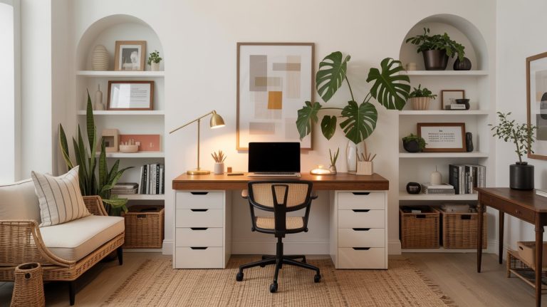
Cool Colors (Calming & Focused)
Cool colors like blue, green, and purple are like a spa day for your home. They bring calm, promote focus, and generally encourage deep breaths. Ideal for bedrooms, home offices, and anywhere you need to chill out.
- Blue: The MVP of calm. Blue lowers stress levels and even slows down your heart rate. Light blues belong in bedrooms and bathrooms, while navy or royal blues add a dash of elegance to dining rooms and studies.
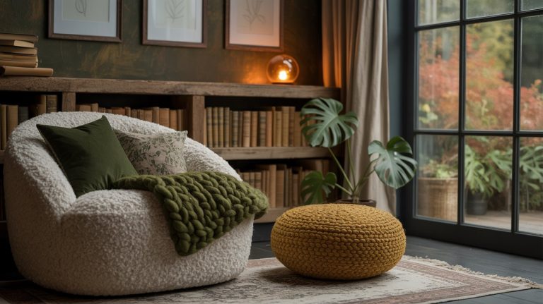
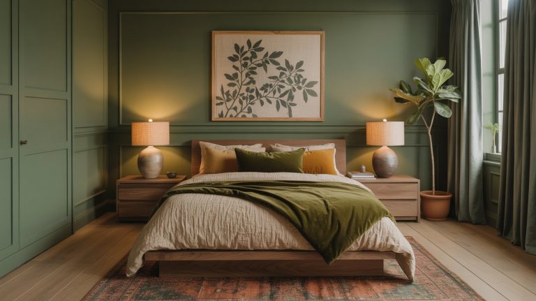
- Green: Nature’s neutral. Green promotes balance, growth, and good vibes. A solid pick for literally any room. Use soft sage for that “I have my life together” aesthetic or deep forest green for cozy library feels.
- Purple: Creative, luxurious, and a little mysterious. Lavender sets the stage for relaxation in bedrooms, while richer plums add drama to reading nooks and powder rooms.
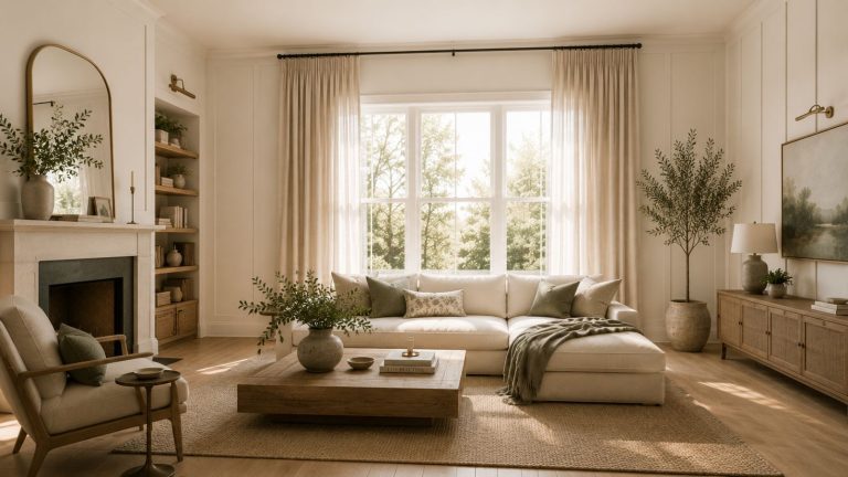
Neutral Colors (Balanced & Timeless)
Neutrals are the quiet kids at the party—reliable, laid-back, and always appropriate. They play well with others and let bold colors have their moment.
- Gray: Cool, composed, and versatile. Gray is the go-to for modern living rooms, kitchens, and bedrooms. Mix it with brighter hues to avoid the dreaded “boring box” effect.
- Beige: Warm, cozy, and basically a hug for your walls. Ideal for family rooms or hallways where you want the vibe to feel relaxed but not too snoozy.
- White: The Marie Kondo of colors—clean, simple, and refreshing. Best for brightening up small spaces, but add texture or wood accents to keep it from feeling like a hospital.
Bold and Dark Colors (Dramatic & Cozy)
Dark colors are like that moody friend who always looks effortlessly cool. They add depth, drama, and coziness, making rooms feel sophisticated yet intimate.
- Black: Bold, timeless, and forever chic. Perfect for accent walls, bookshelves, or front doors. Just use sparingly unless you’re going for the Batcave look.
- Charcoal: A softer, moodier version of black. Ideal for creating cozy corners or turning your den into a stylish sanctuary.
- Deep Green: Luxurious, calming, and packed with personality. Great for statement walls, studies, or anywhere you want to feel wrapped in sophistication.
Special Shades for Special Needs:
- For Anxiety: Stick to soft blues, greens, and muted tones. Sherwin-Williams “Sea Salt” or Farrow & Ball’s “Skylight” are like a Xanax for your walls.
- For Productivity: Energize your home office with vibrant yellows or greens. Benjamin Moore’s “Pale Avocado” or Sherwin-Williams’ “Lemon Twist” will keep those creative juices flowing.
- For Better Sleep: Darker blues and muted lavenders help dial things down at bedtime. Try Farrow & Ball’s “Pigeon” or Benjamin Moore’s “Hale Navy.”
Cheat Sheet: Popular Paint Colors by Mood
Calming:
- Sherwin-Williams – Sea Salt (SW 6204)
- Benjamin Moore – Healing Aloe (1562)
- Farrow & Ball – Skylight (No. 205)
Energizing:
- Benjamin Moore – Caliente (AF-290)
- Sherwin-Williams – Gambol Gold (SW 6690)
- Farrow & Ball – Charlotte’s Locks (No. 268)
Neutral and Timeless:
- Benjamin Moore – Revere Pewter (HC-172)
- Sherwin-Williams – Accessible Beige (SW 7036)
- Farrow & Ball – Elephant’s Breath (No. 229)
Bold and Dramatic:
- Sherwin-Williams – Tricorn Black (SW 6258)
- Benjamin Moore – Salamander (2050-10)
- Farrow & Ball – Hague Blue (No. 30)
Color isn’t just decoration—it’s mood magic. Choose wisely, and let your walls do the heavy lifting!
Please note: This website contains affiliate links. As an Amazon Associate, we earn from qualifying purchases at no additional cost to you.