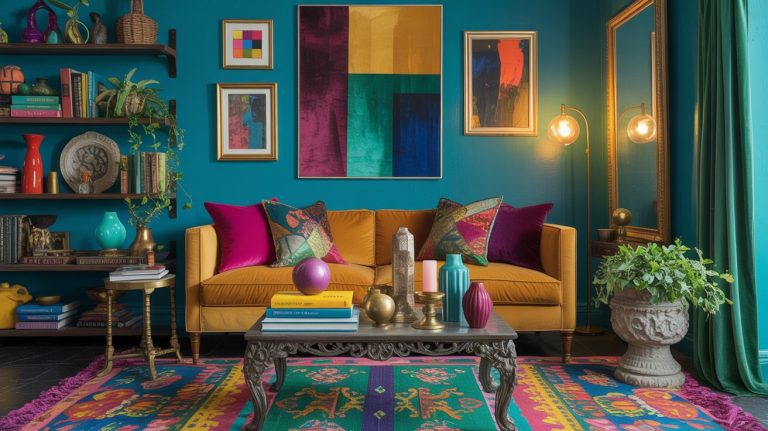
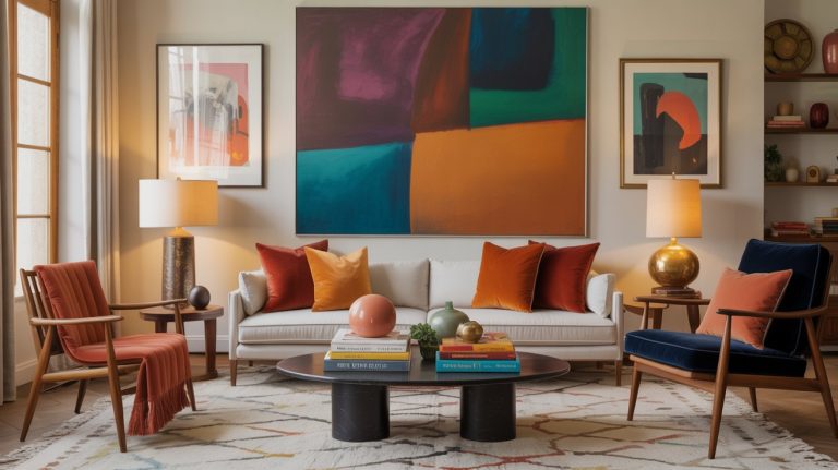
Are You Making This Decorating Mistake? How To Fix it Fast
Please note: This website contains affiliate links. As an Amazon Associate, we earn from qualifying purchases at no additional cost to you.
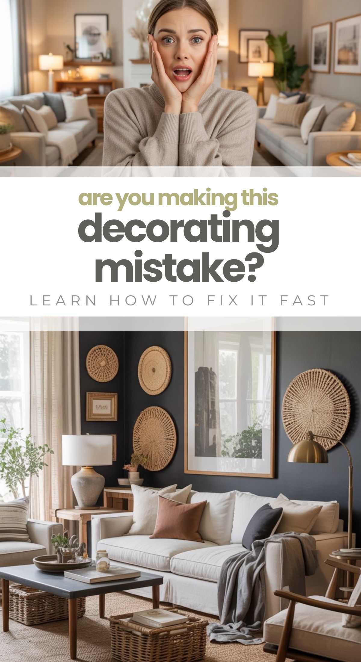
You ever walk into your home, look around, and think, “Why does this still look… meh? I cleaned, I fluffed, I hid the Amazon boxes…”
Yep. Been there.
Here’s the truth no one tells you:
Your home probably isn’t messy — it just feels visually chaotic.
And the biggest culprit?
A decorating mistake almost everyone makes without realizing it.
The best part?
It’s insanely easy to fix. Like, you-could-fix-it-in-the-next-20-minutes easy.
The Mistake | Not Having a Clear Color Palette
Why This Makes Your Home Look Messy
When a room is full of mismatched tones, competing colors, and “I-just-liked-it-so-I-bought-it” décor, your eye doesn’t know where to land.
Everything is fighting for attention.
Your space ends up feeling cluttered — even if it’s squeaky clean.
This is the most common mistake because:
- We collect pieces over time
- Sales exist and we get excited
- Pinterest told us we “should” like sage green but then we bought a rust pillow because it was fall
- It happens to literally everyone
A room without a color palette is like an outfit without a plan:
It just looks… off.
How to Fix It Fast
Step 1 | Choose a Color Palette
Think of this as your home’s wardrobe.
Your palette needs three to four colors:
- One main neutral (white, cream, greige, soft gray, tan)
- One anchor color (forest green, navy, charcoal, terracotta)
- One to two accent colors (mustard, black, blush, rust, sage, gold, wood tone)
- Optional metal tone (brass, matte black, chrome)
Stick to it — religiously.
Step 2 | Remove Anything That Doesn’t Fit
This is the 10-minute magic move.
Pull out anything that’s a totally rogue color.
(Your turquoise throw pillow from 2012 knows it’s time.)
Immediately the room will feel calmer. Promise!
Step 3 | Bring in Textures to Add Depth
When your colors are simplified, textures do the heavy lifting:
- Woven baskets
- Chunky knit throws
- Linen curtains
- Rattan accents
- A cozy, nubby rug
Texture = warmth without creating chaos.
Step 4 | Repeat Each Color at Least 3 Times
This instantly makes your room feel intentional.
A designer trick that always works.
Example:
If you add a mustard pillow → add mustard in artwork and a vase.
If you bring in black frames → add black candle holders and a lamp base.
Repetition = cohesion.
Step 5 | Add One Oversized Statement Piece
This is the final polish that makes everything look expensive.
A large wall art piece, big plant, oversized mirror, or dramatic light fixture creates a focal point so your room doesn’t feel busy.
Your room goes from “random stuff everywhere” to
“Hello, I am a curated Pinterest queen.”
Examples of Color Palettes That Never Fail
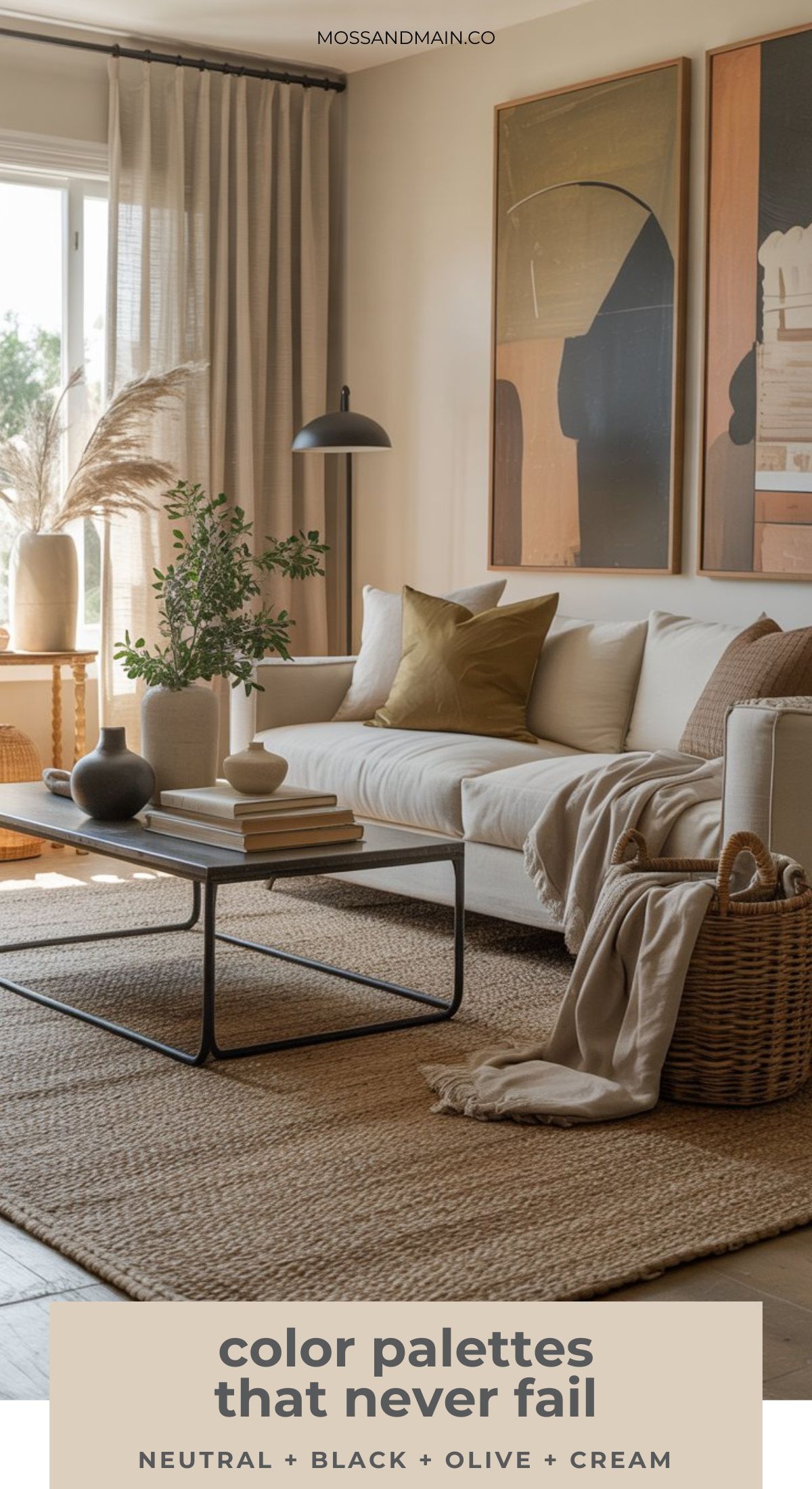
Neutral + Black + Wood + Green
Calm, modern, high-end.
Perfect for Scandinavian, farmhouse, or modern organic vibes.
Cream + Rust + Mustard + Olive
Warm, cozy, and wildly trendy for 2026.
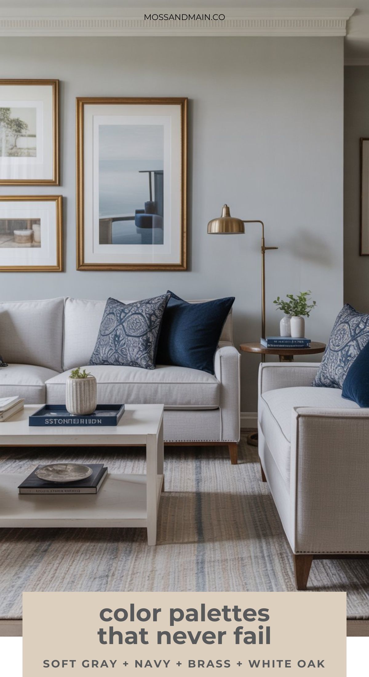
Soft Gray + Navy + Brass + White Oak
Timeless and designer-approved.
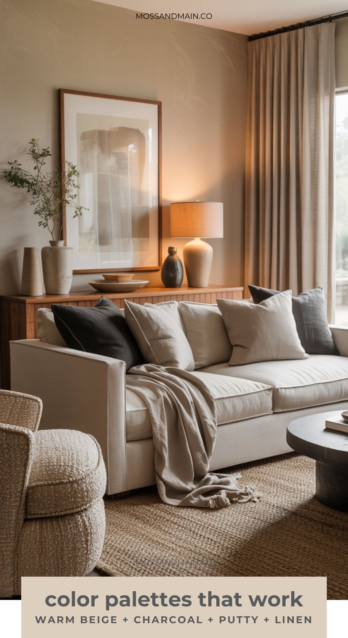
Warm Beige + Charcoal + Putty + Linen
Minimal, earthy, luxurious.
A Quick Visual Guide to Choosing the Right Palette
Step-by-Step Palette Builder
- Pick your neutral
- Choose your anchor
- Add 1–2 accents
- Choose your metal
- Repeat each color 3 times
- Layer textures
- Add one oversized piece
Simple. Fast. Game-changing.
What to Do If You’re Starting From Scratch
If your current décor looks like a thrift store grabbed a megaphone and shouted “SURPRISE!”, start here:
Anchor Your Palette With One Big Thing
Choose one major item to inspire your palette:
- Your rug
- Your sofa
- Your favorite piece of art
Pull colors from that one item and build around it.
Keep It Neutral Until You Gain Confidence
If you’re overwhelmed, go:
- Neutral sofa
- Neutral curtains
- Neutral rug
Then add color only through pillows, throws, art, and plants.
It’s basically training wheels for interior design, and it works every time.
FAQs
What if I like a lot of different colors? Do I have to stick to a palette?
Nope — you can still love color and keep your home looking pulled together.
Just pick a base palette (your 3–5 colors) and let your fun, bold colors show up as patterns, artwork, or seasonal accents.
Think of the palette as the glue, not the jail.
How many colors is “too many”?
If you can’t describe your color palette in one sentence, you probably have too many.
Most designers stick to one main neutral + one anchor color + one or two accents.
Once you go past five, the room starts to feel visually noisy.
Do I need to replace everything to fix this?
Definitely not.
Most people fix the “messy feeling” by:
- Removing items that don’t fit the palette
- Repeating colors they already have
- Adding 1–2 textures
- Swapping a few small décor pieces
90% of the time, this costs less than $50 and takes maybe 20 minutes.
What if my furniture is all different colors?
You can still make it work. Try this:
- Choose the most dominant piece (usually your sofa or rug)
- Build your palette from that item
- Use throws, pillows, and art to tie in the other colors
It becomes intentional instead of accidental.
Will a color palette make my home look too “matchy-matchy”?
Not if you use textures — this is the secret.
You can repeat cream five times, and if one is linen, one is boucle, one is a ceramic vase, one is a chunky knit, and one is painted wood…
It looks layered, not matchy.
How do I pick a palette if I have no idea what my style is?
Try one of these quick-start tricks:
- Pick a rug you love and pull colors from it
- Choose one piece of artwork and let it lead the room
- Screenshot 10 rooms you adore and look for repeating colors
- Use a neutral base and add one or two colors you always gravitate toward
Your style will reveal itself way faster than you think.
I rent — can I still fix this mistake?
Absolutely.
Use renter-friendly moves like:
- Coordinated throw pillows
- Peel-and-stick art frames
- Removable wallpaper
- A cohesive rug, curtains, and throw combo
- Plants (always a win)
Color cohesion works regardless of whether you own or rent.
Does this rule apply to small spaces?
Yes — and even more so.
Small rooms get visually cluttered very quickly.
A simple, intentional palette instantly makes your home feel bigger, calmer, and more polished.
Do I need to include metal finishes in my palette?
You don’t have to, but it helps.
Mixing metals is fine, but sticking to one dominant tone (like brass or matte black) gives your room a high-end, designer feel without any extra effort.
What if I actually like the “eclectic” look?
Then lean into it — but there’s still a method. Even maximalist homes use a color strategy. Try choosing:
- One grounding neutral
- One vibrant color family (like jewel tones or earth tones)
- Intentional repetition
Eclectic doesn’t mean chaotic.
It just means you’re playing with more personality.
Please note: This website contains affiliate links. As an Amazon Associate, we earn from qualifying purchases at no additional cost to you.


