The Psychology of Color: Why 2026 is the Year of the Soulful Home
Please note: This website contains affiliate links. As an Amazon Associate, we earn from qualifying purchases at no additional cost to you.
Have you ever walked into a room and felt your shoulders immediately drop two inches?
Or maybe you’ve stepped into a kitchen that felt so high-energy you suddenly had the urge to host a six-course dinner party?
That isn’t just a coincidence—it’s Color Psychology in the wild.
For years, we’ve been playing it safe. We’ve lived in a world of “Millennial Gray” and “Sad Beige,” where the goal was to make our homes look like pristine, flippable showrooms. But as we move into the new year, the design world is experiencing a massive, beautiful vibe shift.
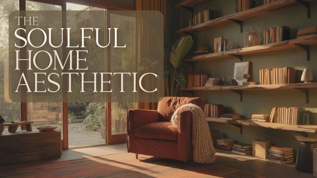
We are officially entering the era of the Soulful Home.
Be sure to read to the end where you can take our quick ‘Color Quiz‘ to see what color you are missing most in your life!
We’ve leaned into minimalist restraint for many years, with walls that whispered instead of spoke. But the design world is pivoting toward something more intentional: Emotional Utility.
We’re no longer asking if a paint color is “timeless” (spoiler alert: no color really is!). Instead, we’re asking: How does this shade make me feel at 8:00 AM on a rainy Tuesday?
From the grounding, restorative power of Jade to the unapologetic, sun-baked joy of Persimmon, the new color palette for your home is all about Intentional Living.
Whether you’re looking to create a “cocoon effect” in your bedroom through Color Drenching or you want to inject some Dopamine Decor into a dull home office, understanding the “why” behind the hue is your new secret weapon.
Grab a matcha, get cozy, and let’s dive into how these trending tones can actually help you design a life you love—one room at a time.
The Soulful Home: Color Options
The Power of “Persimmon”: Your Daily Dose of Vitamin C
If your home feels a little stagnant or “quiet,” Persimmon is the shot of espresso you didn’t know you needed.
This year, we’ve moved away from the neon oranges of the past and landed on this sophisticated, sun-baked terracotta hybrid.

The Psychology: Persimmon is a “high-arousal” color, but because it has those earthy, clay-like undertones, it doesn’t feel frantic. It stimulates the sacral chakra, which is associated with creativity and social connection. It physically mimics the glow of a “Golden Hour” sunset, signaling to your brain that it’s time to unwind, connect, and enjoy a meal.
The Moss & Main Way: * The “Social Hub”: Use it in a dining room or a “Conversation Pit” style living area. It makes guests feel instantly welcome and—fun fact—it actually makes food look more appetizing.

- Small Scale: Not ready to commit to a full wall? Try velvet Persimmon throw pillows or a heavy ceramic vase. It’s the ultimate “Dopamine Decor” accent.
The “Jade” Revolution: A Deep Breath for Your Interior
While Persimmon is the “life of the party,” Jade is the “meditation retreat.” As our world gets more digital, we are seeing a massive trend toward something called Biophilic Immersion—the need to feel surrounded by nature even when we’re sitting in front of a laptop.
The Psychology: Green is the only color that requires no adjustment for the human eye to focus on; it is inherently restful. Jade, specifically, has a cool blue undertone that lowers the heart rate and reduces cortisol levels. It’s the visual equivalent of a forest hike.

The Moss & Main Way:
- The “Cocoon Effect”: This is where Color Drenching comes in. Paint your walls, baseboards, and even your ceiling in a matte Jade. It blurs the edges of the room, making a small home office or bedroom feel like an infinite, peaceful sanctuary.
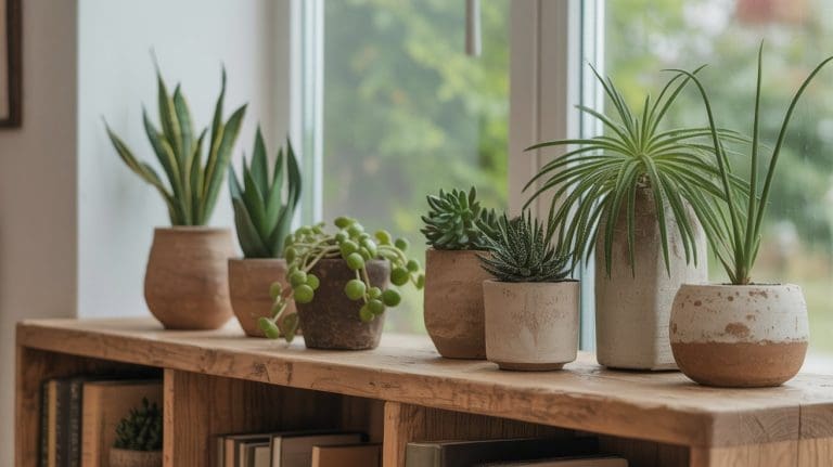
- Texture Pairing: Jade looks most expensive when paired with “Moss” textures—think nubby bouclé fabrics, raw light oak, and plenty of actual trailing plants to layer those greens.

Design Note: When using Jade, avoid high-gloss finishes. A matte or eggshell finish absorbs light rather than bouncing it, which is the key to achieving that “grounded” feeling we’re all craving this year
Plum Noir: The New Neutral for Intimacy
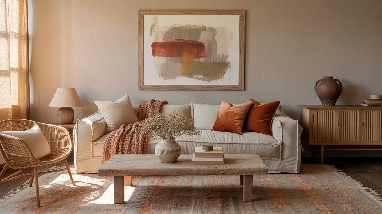
If Persimmon is a sunrise and Jade is a forest hike, Plum Noir is that magical hour just after the sun dips below the horizon. We’re seeing a massive shift away from harsh charcoal and flat black toward this “near-black” purple. It’s deep, desaturated, and incredibly expensive-looking.
The Psychology: Purple has long been associated with luxury and the subconscious. In its darkest “Noir” form, it signals to your brain that the workday is officially over. It promotes introspection and deep relaxation. If you struggle to “switch off” your brain at night, this is the color that gives you permission to unplug. It doesn’t demand your attention; it holds you in a quiet, sophisticated embrace.

The Moss + Main Way:
- The “Sensory Library”: This is the ultimate shade for a reading nook, a media room, or a primary bedroom. When you use Plum Noir, you aren’t just painting a wall; you’re creating an Atmospheric Anchor.
- Monochromatic Layering: To keep it from feeling too “gothic,” layer it with different textures in the same tone. Think a matte Plum wall behind a plush velvet sofa in the same shade. This eliminates “visual noise,” which is a key design principle for reducing anxiety.
- The Glow Factor: Plum Noir loves warm light. Pair it with the “Sanded Stainless” or brushed brass hardware we mentioned earlier. When the evening lamps hit a Plum Noir wall, the room feels like it’s glowing from within.

Pro Tip: If you’re nervous about going dark, start with the Powder Room. It’s the perfect “jewel box” space to experiment with this level of drama without committing the whole living room.
The Grounding Layer: The Warm Neutral Comeback
After years of stark white walls and cool gray everything, 2026 is quietly bringing back something we didn’t realize we missed: warmth.
Not trendy beige.
Not builder-grade tan.
But grounded, enveloping neutrals that feel like they belong to the earth.
If Persimmon is the spark and Jade is the exhale, the grounding layer is the steady heartbeat underneath it all. Let’s talk about the shades making that happen.
Chocolate & Earth Browns: The New Foundation
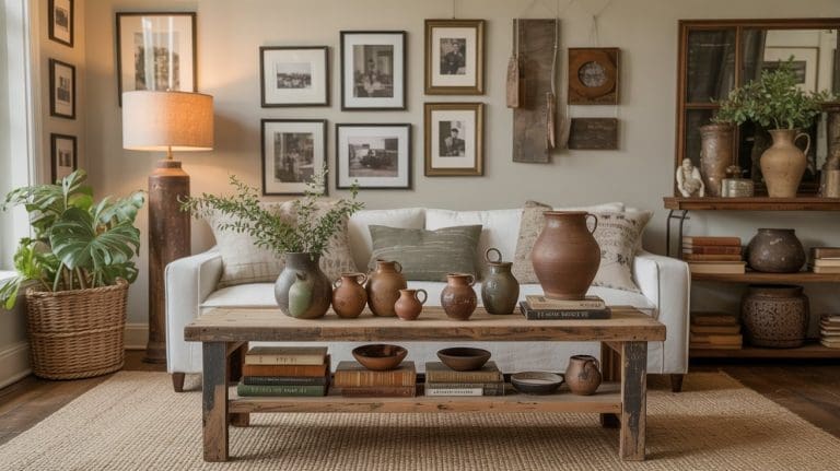
Brown is no longer the forgotten color of the early 2000s. It’s back — but this time it’s rich, velvety, and intentional. Think cacao. Espresso. Saddle leather. Warm umber.
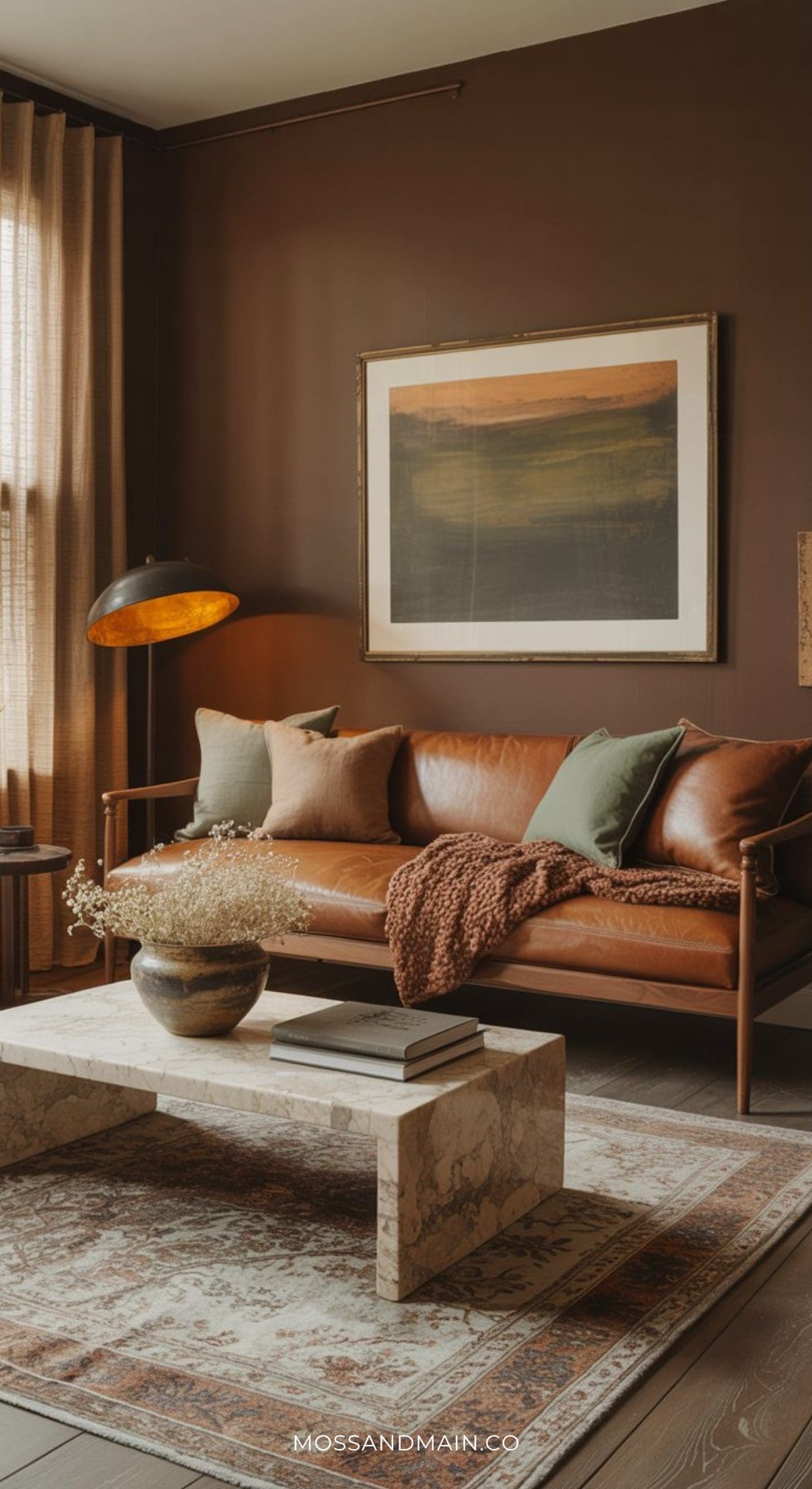
The Psychology: Brown signals safety and stability. It’s the color of soil, tree trunks, aged wood. Your brain reads it as reliable and protective. In a time where everything feels digital and fast, brown slows things down. Unlike black or charcoal, deep brown doesn’t feel severe. It feels held.
The Moss + Main Way: Use chocolate brown as an anchor wall behind a bed, or even better — in a library or reading nook layered with warm wood, sage accents, and soft lighting. Brown also pairs beautifully with muted sage, soft clay, and oatmeal textiles.
It doesn’t scream for attention. It supports everything else in the room.
Related: Brown Is the New Black: 21 Must-See Brown Living Room Ideas
Oatmeal Beige: The Soft Reset
Oatmeal beige is the anti–“Sad Beige.” It’s warm, creamy, and slightly textured — like linen in paint form. It’s not trying to be invisible. It’s trying to be calming.
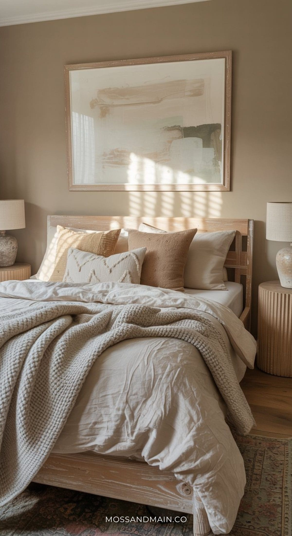
The Psychology: Warm neutrals reduce visual stress. They create a background that doesn’t demand attention, which lowers mental fatigue. In color psychology terms, this is low-arousal support.
It’s the difference between walking into a room that feels staged… and walking into one that feels lived in.
The Moss & Main Way: If you’re not ready for Persimmon or Plum Noir, start here. Use oatmeal beige on walls, then layer in crinkled linen bedding, nubby bouclé pillows, raw oak furniture and handmade ceramics.
It creates instant softness without sacrificing depth.
Soft Greige & Muted Green-Infused Neutrals
Here’s where it gets interesting. Greige is evolving. The cool, sterile versions are fading out. In their place? Warmer, slightly green-infused neutrals that feel organic instead of flat. Think:
- Mushroom tones
- Warm stone
- Taupe with a whisper of olive
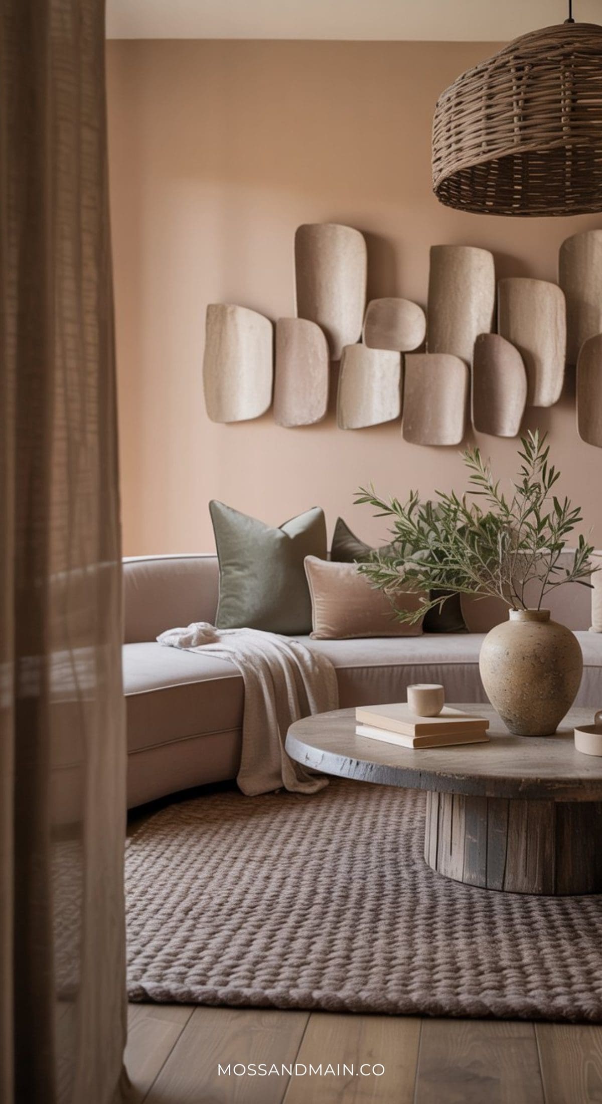
The Psychology: Green-based neutrals subtly connect us to nature without shouting “forest.” They provide the restorative effect of Jade in a much quieter way. They’re incredibly versatile — which is why they’re becoming the secret weapon of designers who want calm without drama.
The Moss & Main Way: Use these tones in spaces that need longevity like hallways, living rooms, guest bedrooms and transitional spaces. Pair with layered lighting and textured fabrics, and the result feels expensive and effortless.
Why the Grounding Layer Matters
Here’s the truth: bold colors are beautiful. But without grounding tones, they can feel overwhelming.
The Soulful Home aesthetic isn’t about painting every wall a statement shade. It’s about balance.
It’s about knowing when to energize (Persimmon), when to restore (Jade), when to cocoon (Plum Noir)… and when to steady the room with warmth and depth.
That’s the difference between a trendy home and a soulful one.
How to Choose Your Personal “Anchor” Color
Now that we’ve toured the 2026 palette, how do you actually choose? It all comes down to Functional Feeling. Ask yourself:
- What is the “Missing Ingredient” in my life right now? (Is it Energy? Rest? Focus?)
- When do I use this room most? (If it’s a morning room, lean toward Persimmon. If it’s a “wind-down” space, go Jade or Plum.)
Ready to bring these colors home? Here are a few of our paint color recommendations…
1. The Persimmon Palette
The Goal: A warm, sun-baked terracotta that feels energizing but grounded.
- Sherwin-Williams: Persimmon (SW 6355)
- This was a massive trend-setter for a reason. It’s the gold standard for that “earthy apricot” look.
- Benjamin Moore: Southwest Pottery (048)
- A key color in their 2026 Trends Palette. It has a slightly more clay-like, sophisticated depth that feels very high-end.
- Pro Tip: If you want it a hair more muted, try Sherwin-Williams: Cavern Clay (SW 7701).
2. The Jade Palette
The Goal: A deep, restorative green that feels like a forest canopy.
- Sherwin-Williams: Jade Dragon (SW 9129)
- This has a beautiful blue-gray undertone that keeps the green from feeling too “primary” or grassy. It’s very calming.
- Benjamin Moore: Jade Green (2037-20)
- This is a richer, more saturated jewel tone. If you are doing Color Drenching (walls, trim, and ceiling), this is the one to pick for a high-drama “cocoon” effect.
- Pro Tip: For a slightly more organic, “mossy” feel, look at Benjamin Moore: Narragansett Green (HC-157)—it’s a moody cult favorite.
3. The Plum Noir Palette
The Goal: A near-black purple that feels intimate and expensive.
- Sherwin-Williams: Perle Noir (SW 9154)
- This is a “chameleon” color. In low light, it looks like a soft black, but when the sun hits it, the deep violet soul comes out.
- Benjamin Moore: Silhouette (AF-655)
- The 2026 Color of the Year. It is an incredible espresso-plum-charcoal hybrid. It’s the ultimate “quiet luxury” paint color.
- Pro Tip: If you want more “plum” and less “noir,” go with Benjamin Moore: Caponata (AF-650). It’s luscious and feels like a glass of fine wine.
Finding Your “Color Anchor”: The Soulful Home Aesthetic Mood Quiz
Choosing a color palette shouldn’t just be about what’s trending on your feed — it should be about what’s missing in your everyday life.
Are you craving energy? Quiet? Depth? Stability?
Take this quick vibe check to discover which 2026 anchor shade your home (and nervous system) might actually be craving.
1️⃣ When you walk through your front door after a long day, what do you instinctively want to do?
• A) Turn on music, pour something fun, and re-energize the room.
• B) Dim the lights, curl up somewhere cozy, and disappear for an hour.
• C) Open a window, water the plants, and reconnect with nature.
• D) Kick off my shoes, exhale deeply, and feel instantly grounded.
2️⃣ Which “Micro-Moment” sounds like your perfect Saturday morning?
• A) Hosting brunch at a sun-drenched wooden table with friends.
• B) Sleeping in late with heavy curtains drawn and a candle flickering.
• C) Coffee by the window surrounded by trailing plants and soft light.
• D) Slow breakfast in a warm, neutral space that feels calm and steady.
3️⃣ If your current home had a “Volume Level,” what would you want to change?
• A) It’s too quiet — I want more warmth and life.
• B) It’s too chaotic — I need more intimacy and depth.
• C) It’s too sterile — I want it to feel organic and layered.
• D) It feels unanchored — I want it to feel stable and cohesive.
The Results: Your 2026 Soul Match
Mostly A’s: You’re a Persimmon Spirit
You’re craving Social Vitality.
Your home is meant to feel alive — warm, welcoming, and slightly sun-baked. Persimmon adds movement and glow without feeling chaotic. Use it in dining rooms, kitchens, or creative spaces where you want connection and conversation to flow naturally.
Mostly B’s: You’re a Plum Noir Devotee
You’re craving Sensory Sanctuary.
Your nervous system needs permission to switch off. Plum Noir creates intimacy and visual quiet — especially when layered monochromatically with velvet, matte finishes, and warm brass lighting. This is your cocoon color.
Mostly C’s: You’re a Jade Alchemist
You’re craving Biophilic Balance.
You need your indoor world to feel like the outdoors. Jade lowers visual stress and restores calm, especially when color-drenched across walls and ceilings. Pair it with raw wood, textured fabrics, and real greenery for full immersion.
Mostly D’s: You’re a Grounded Neutralist
You’re craving Emotional Stability.
This is where the warm neutral comeback shines. You don’t want drama — you want depth.
Your palette lives in chocolate browns, oatmeal beige, mushroom and and soft green-infused neutrals. These tones create a steady, supportive backdrop for everyday life. They don’t steal attention. They hold space.
Bonus: What If You’re Split Between Two?
If your answers are evenly split, you likely need a layered palette. Example pairings:
- Persimmon + Oatmeal → Energy balanced with softness
- Jade + Mushroom Greige → Calm with longevity
- Plum Noir + Chocolate Brown → Intimate but deeply grounded
That’s the real secret of the Soulful Home.
Conclusion: Designing for the Soul
At Moss & Main, your home isn’t just four walls and a roof — It’s the backdrop to your life.
Whether you drench a room in Jade, lean into the glow of Persimmon, cocoon yourself in Plum Noir, or steady everything with warm neutrals, the goal is simple:
Design for how you want to feel.
Because in 2026, “timeless” doesn’t mean neutral.
It means intentional.
Please note: This website contains affiliate links. As an Amazon Associate, we earn from qualifying purchases at no additional cost to you.