Blue and Mustard: The Organic Modern Color Palette
Please note: This website contains affiliate links. As an Amazon Associate, we earn from qualifying purchases at no additional cost to you.
The Ultimate Color Scheme · Warm. Collected. Timeless.
Some color combinations feel like they belong to a specific era — and then there are pairings that simply refuse to go out of style. Blue and mustard is the latter. Rooted in the rich tradition of earthy, nature-inspired interiors, this organic modern color palette has surged back into homes because it solves a problem most people quietly struggle with: how to make a space feel warm and sophisticated at the same time.
Whether you call it mustard, ochre, or warm gold — and whether your blue leans dusty teal, deep navy, or slate — the combination creates an atmosphere that feels collected rather than decorated. Every element looks intentional. Nothing feels sterile. Earthy. Elevated. Effortlessly cozy.
In this guide, we’ll walk you through exactly how to build this palette in your home — from choosing your specific shades to layering textures, to mixing in the supporting colors that make the whole thing sing.
In the second half, we’ll show you room-by-room design looks you can pull from directly. Can’t wait? Jump to all the room designs and inspo.
What You’ll Learn
- How to Pick the Perfect Color Mix
- How to Layer this Color Palette (i.e. what goes where??)
- Hardware & Accent Colors
- Blue and Mustard Room Designs
- Tips for Renters (or anyone who doesn’t want to paint their walls)
- Styling Cheat Sheet
- Our Designer-Approved Blue and Mustard Paint Color Guide
The How-To Guide
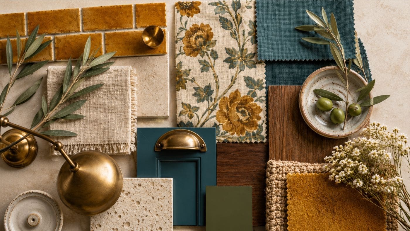
Understanding the Full Organic Modern Palette
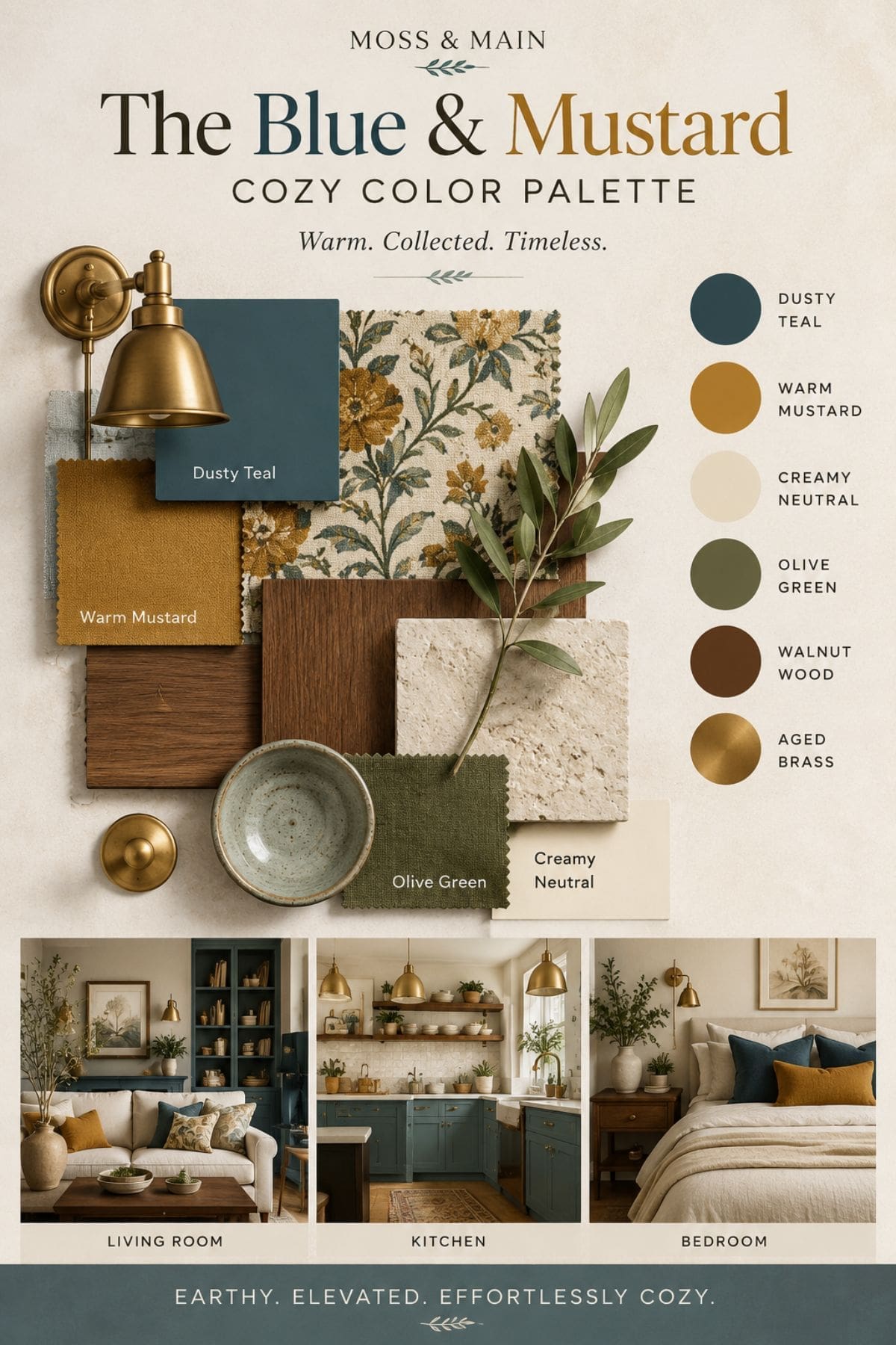
The blue and mustard palette works best when it’s treated as a family of colors — not just two. The six tones that anchor this scheme are:
- Dusty Teal
- Warm Mustard
- Creamy Neutral
- Olive Green
- Walnut Wood
- Aged Brass
Why does this combination work? It’s rooted in color theory.
Blue and mustard/ochre sit opposite each other on the color wheel, making them complementary — which means they naturally create contrast and visual energy when placed together. But because these versions are heavily muted (dusty, earthy, aged), that contrast feels harmonious rather than jarring.
The warm neutrals and olive green act as bridges, softening the transition between the two anchor colors.
Choosing Your Blue
Not all blues read the same way on a wall or in a room. The three main variations you’ll encounter within this palette each create a very different mood:
Dusty Teal: This is the signature blue for this palette. It has green undertones that connect beautifully to olive and walnut, making it feel rooted and organic rather than cool or clinical. It works as a wall color, cabinetry, or upholstery.
Navy Blue: Deeper and moodier, navy creates high drama and works best when balanced with plenty of creamy neutral. If you want a bold, maximalist version of this palette, navy is your choice.
Slate Blue: The softest option. Slate skews more grey-blue and creates an airy, understated base — ideal for bedrooms or spaces where you want the mustard accents to do the heavy lifting.
Practical tip on blue wall paint: Always test your chosen blue in natural light at different times of day. Blues are notoriously chameleon-like — what reads as teal at noon can shift towards green in the morning and near-grey in the evening. Request 12×12 sample cards and live with them for 48 hours before committing. For finish: use matte on walls for that soft, editorial look. Use satin or eggshell on trim and built-ins for subtle contrast and durability.
Getting the Mustard Right
Mustard, ochre, and warm gold are often used interchangeably — and while they’re close cousins, understanding the nuances helps you make sharper decisions.
- Mustard — warmer, more golden-yellow. High energy, works beautifully in accents like pillows, throws, and rugs.
- Ochre — slightly more orange-brown. Earthier and more muted. Excellent as a wall color or tile.
- Warm Gold / Aged Gold — closer to a metallic. Best used in hardware, lamps, and small accents rather than large surfaces.
The key rule with mustard: the richer and more saturated you go with your blue, the more restrained your mustard should be (use it in textiles). The softer your blue, the bolder you can go with mustard — including as a wall color.
Always pair mustard and ochre with creamy, warm whites — never bright or cool whites. Bright white makes mustard look neon. Creamy neutrals make it look luxurious.
Layering Your Modern Organic Color Palette: Room by Room
A great palette isn’t just about picking the right colors — it’s about distributing them correctly. The 60/30/10 rule is your framework:
- 60% — Your dominant color (usually creamy neutral walls or your chosen blue)
- 30% — Your secondary color (the other of those two, used in furniture and larger textiles)
- 10% — Your accent (mustard, or mustard + olive green together)
Texture is what separates this palette from looking flat or generic. Every material choice is an opportunity to add depth:
- Linen and cotton — for softness on beds, sofas, and curtains
- Velvet — for richness on accent chairs and throw pillows
- Aged brass — for warmth in hardware, lamps, and mirrors
- Ceramic and stoneware — for organic texture in accessories
- Walnut wood — for grounding warmth in furniture
The secret weapon of this palette is a floral or botanical fabric. The classic printed fabric — cream background, dusty blue leaves, mustard blooms — acts as a bridge between all your colors. Use it as curtain panels, a lumbar pillow, or an accent chair and it instantly pulls the room together without you having to do the heavy lifting.
Hardware & Accents — The Details That Elevate Everything
Always Choose Aged Brass Over Chrome or Matte Black
Chrome reads as too modern and cool for this warm palette. Matte black can work in very contemporary versions but risks looking too stark. Aged brass — unlacquered, warm, slightly imperfect — is the natural choice. It echoes the warmth of the mustard, connects to the walnut, and adds a lived-in quality that makes the space feel authentic.
Olive Green as the Grounding Third Tone
Don’t skip the olive. It keeps the palette from becoming a two-note song. Use it in a throw blanket, a single accent chair, a plant, or painted cabinetry in a smaller space. It introduces an organic, botanical quality that makes the whole scheme feel more intentional.
Wood Tone: Walnut Over Light Oak
Light oak can feel Scandinavian and cool — a mismatch for this earthy, warm palette. Walnut or dark-stained oak keeps the warmth consistent throughout the space. If you already have lighter wood floors, layer in a walnut-toned coffee table or nightstand to introduce the right tone.
Part Two — The Design Showcase
Now let’s put the theory into practice. Below are nine fully realized design looks — three each for living rooms, bedrooms, and kitchens — that you can use as direct inspiration or pull from selectively.
Living Room Designs
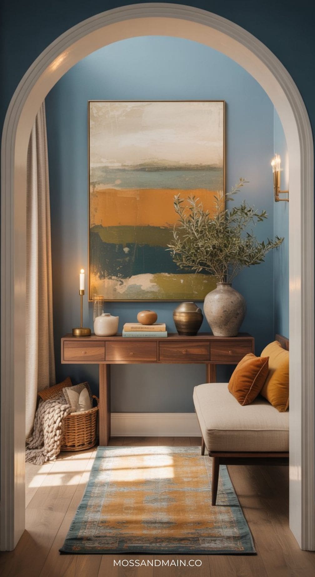
Living Room #1 | Teal Blue and Mustard Living Room
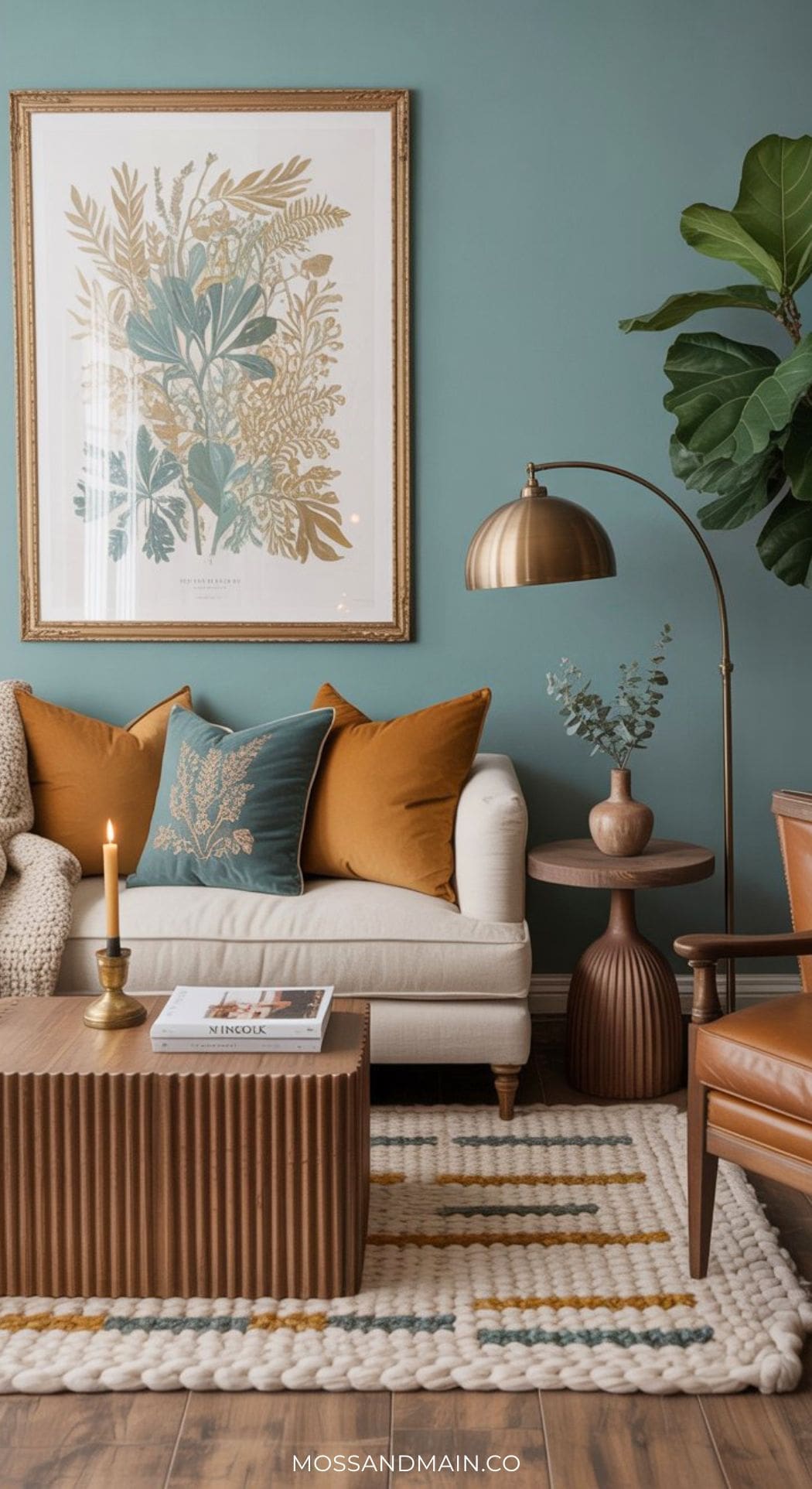
This is the foundational expression of the palette. Dusty teal blue walls create a rich, enveloping backdrop. A cream or off-white linen sofa anchors the seating area and lets the wall color breathe. Mustard enters through throw pillows in velvet, a layered vintage-style rug, and a brass arc floor lamp. A botanical print lumbar pillow bridges all three tones. The result is cozy without being heavy — editorial without feeling staged.
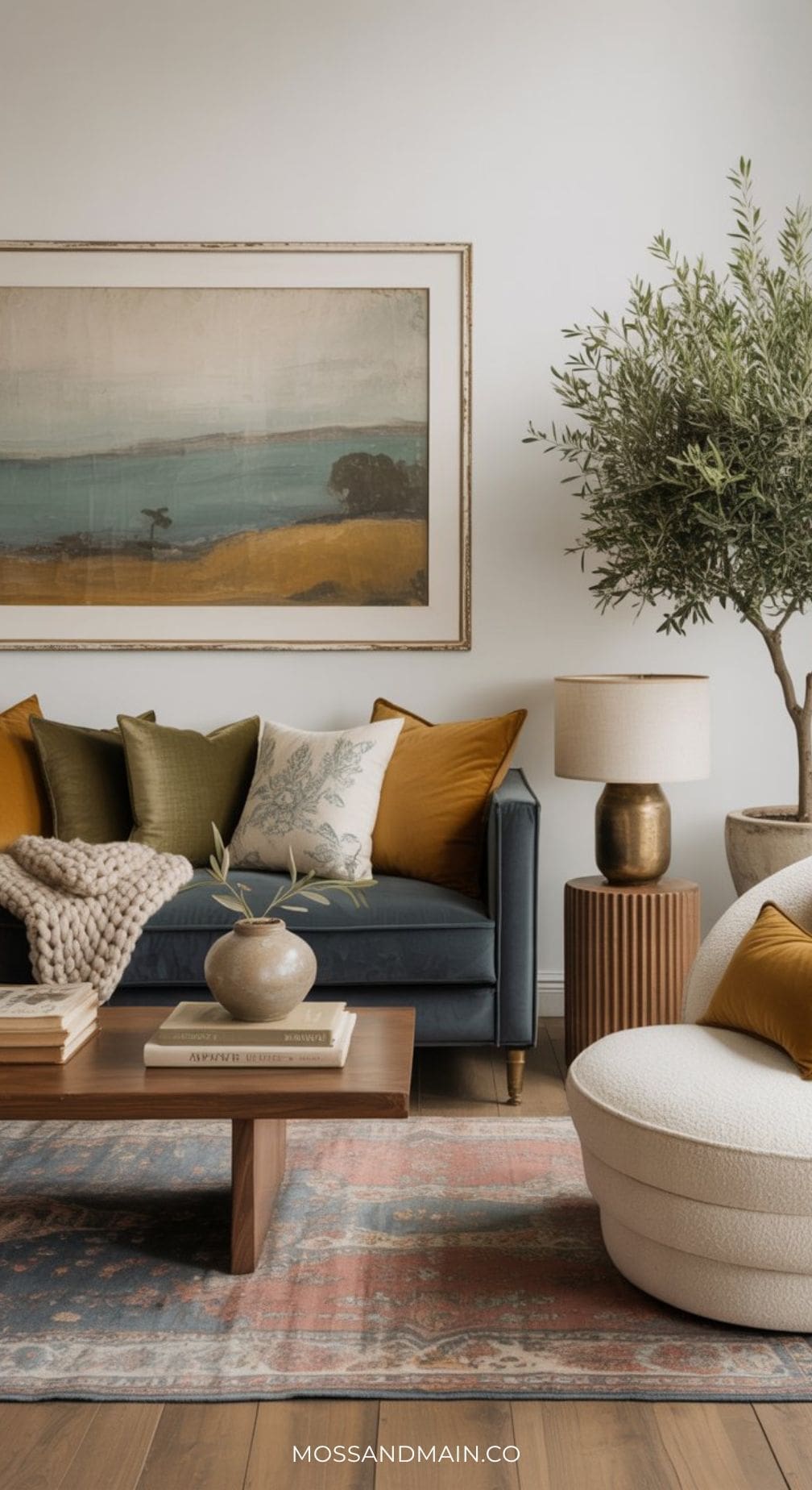
Living Room #2 | Blue and Mustard Living Room with Neutral Walls
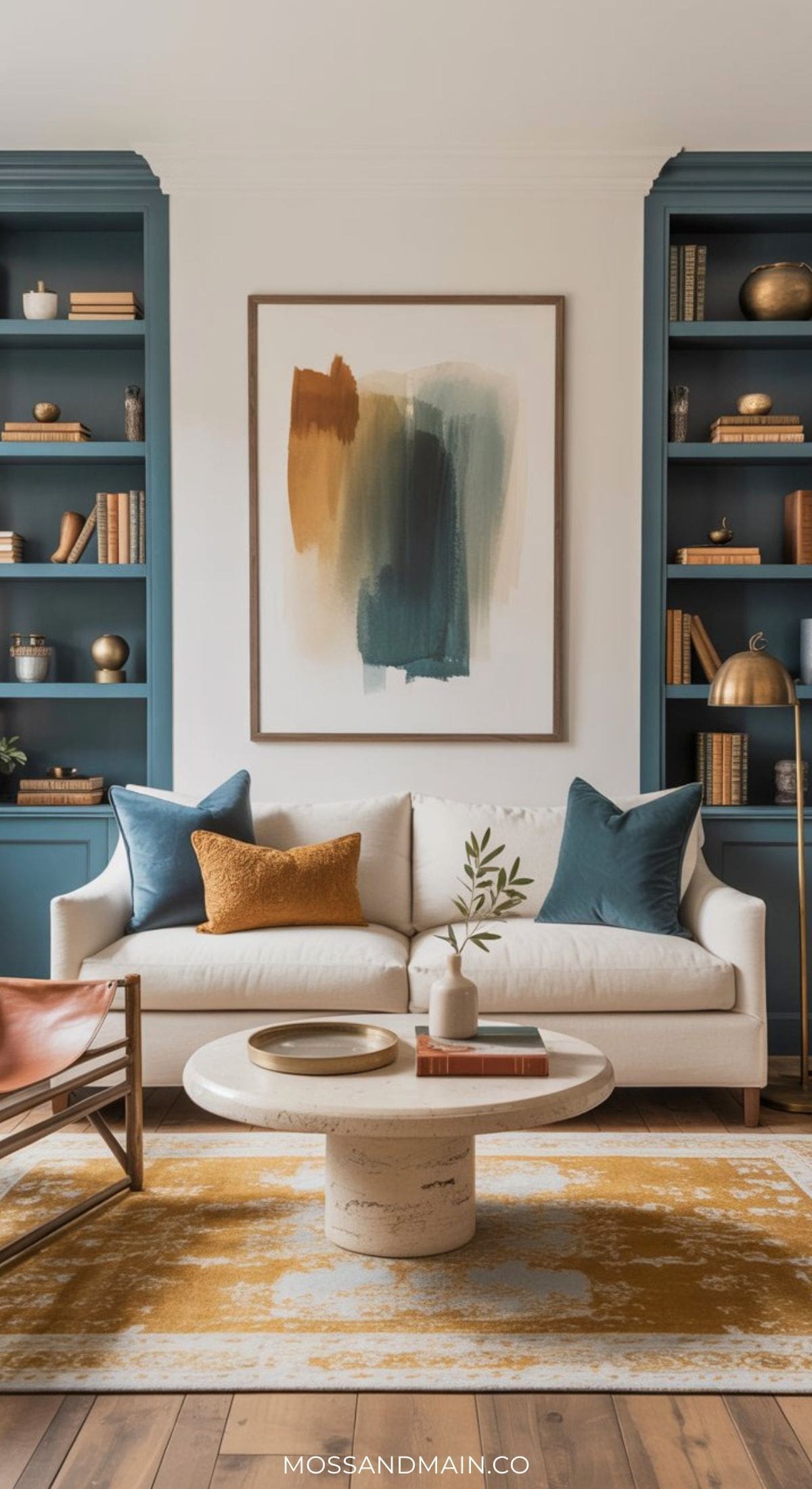
For those who prefer a lighter, airier base, this approach reverses the weight: creamy neutral walls keep the room feeling open, while floor-to-ceiling teal built-in shelving becomes the architectural statement. A large, vintage-style mustard and cream area rug grounds the seating area, and a cream sofa keeps the palette balanced. This look photographs exceptionally well and feels current without chasing trends.
Living Room Look #3 | Mustard Walls + Navy Accents
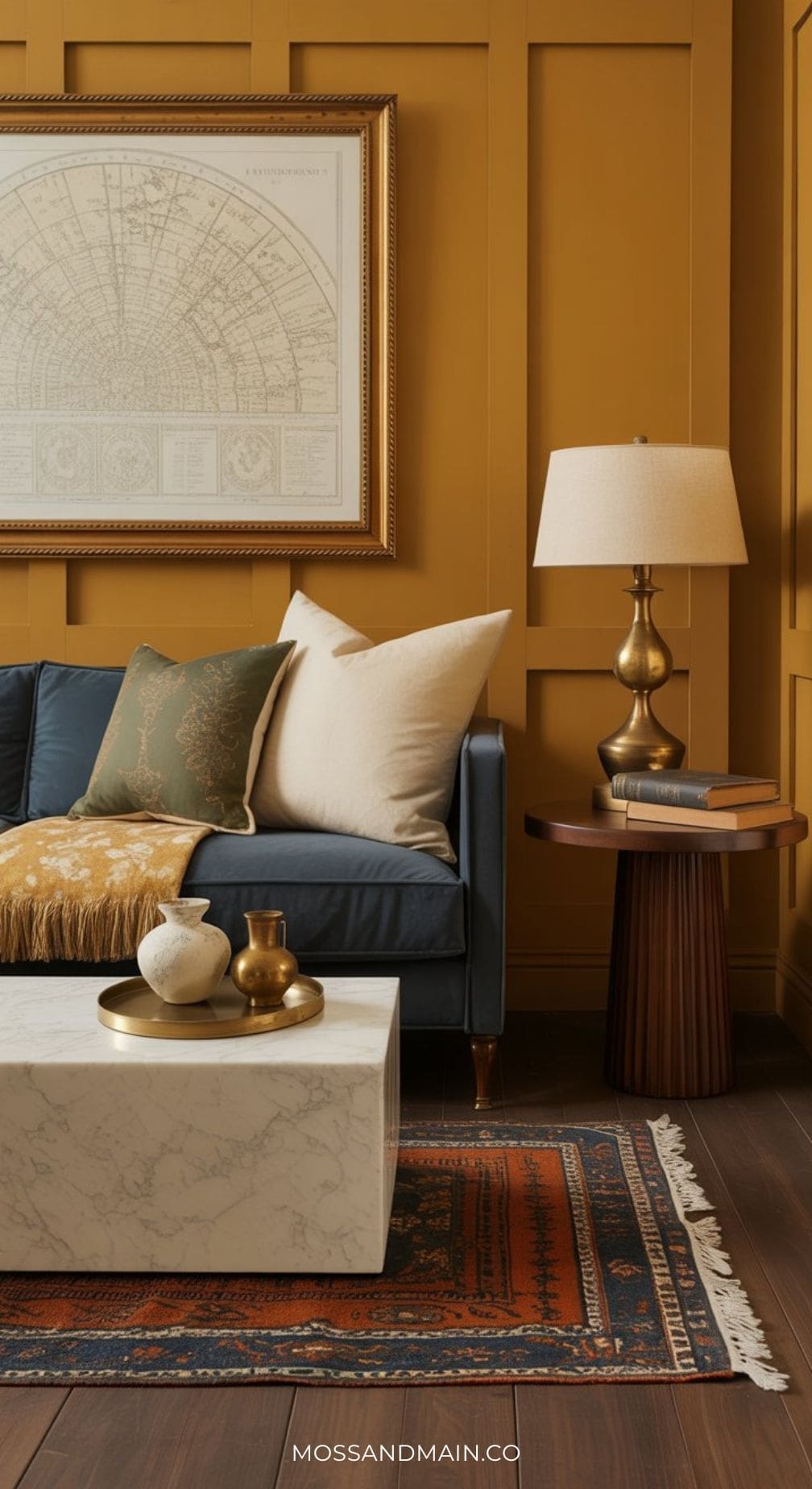
This is the maximalist version of the palette — and when executed with restraint on the accents, it is breathtaking. Deep ochre or warm mustard walls create an enveloping, jewel-box feeling. Navy blue velvet anchors the seating in a deep, rich counterpoint. Creamy neutrals prevent it from feeling dark, and aged brass hardware and lighting keep it glamorous rather than heavy. Best suited to spaces with good natural light.
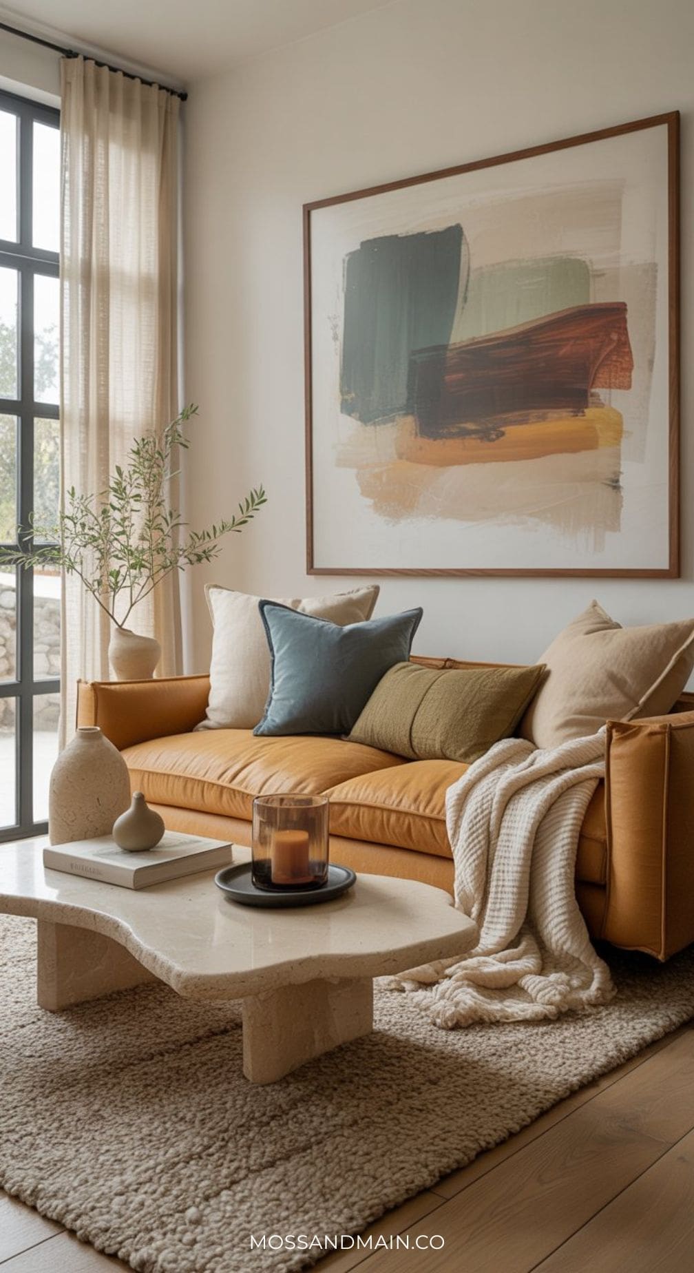
Living Room #4 | Mustard Sofa Living Room Ideas with Blue Accents
Bedroom Designs
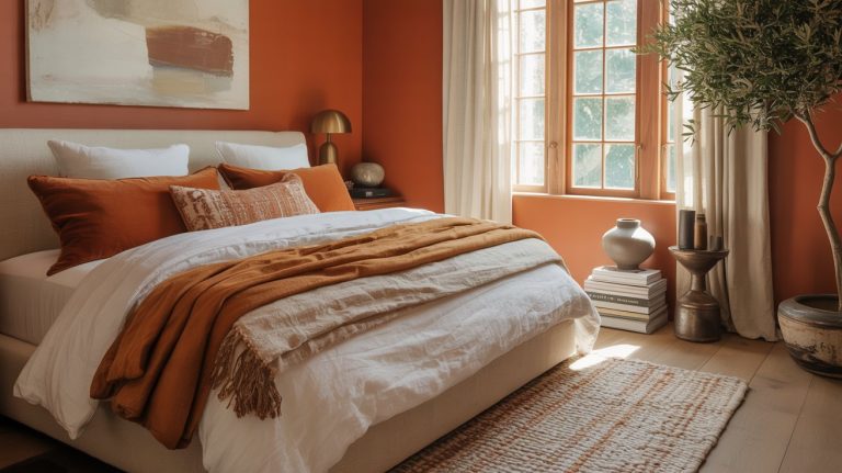
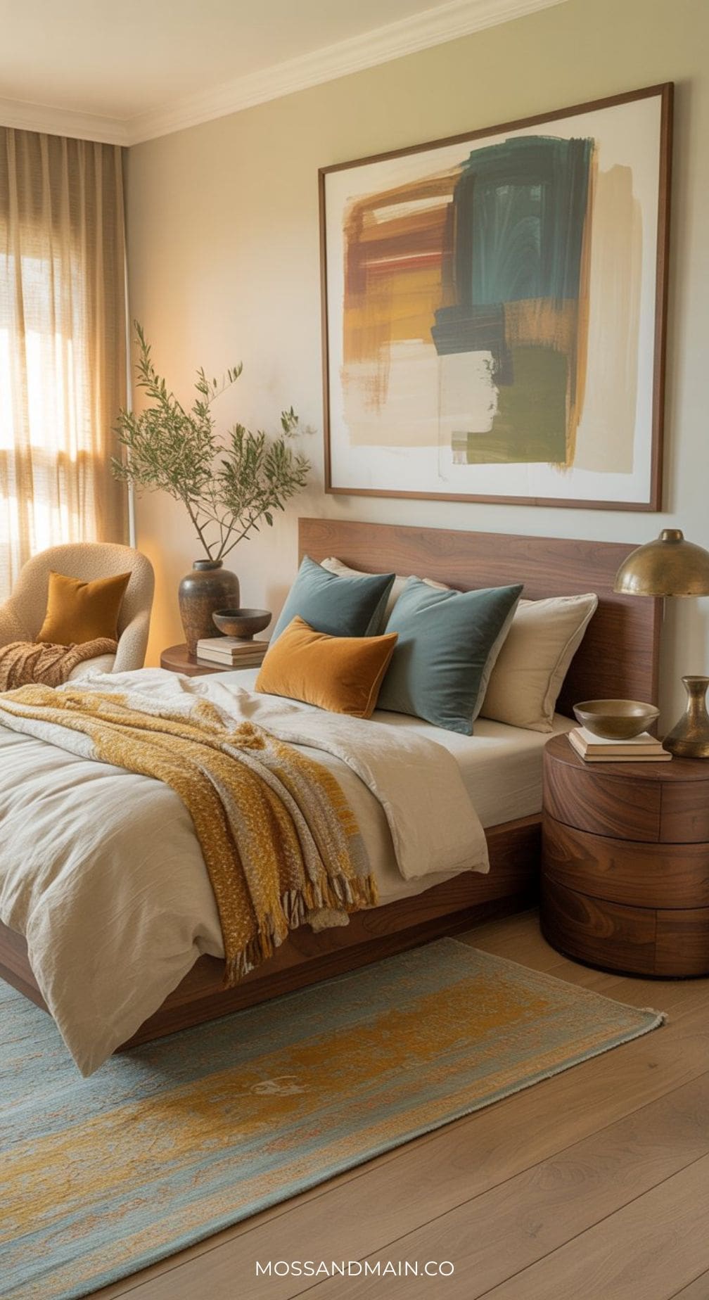
Bedroom #1 | Cozy Blue and Mustard Bedroom
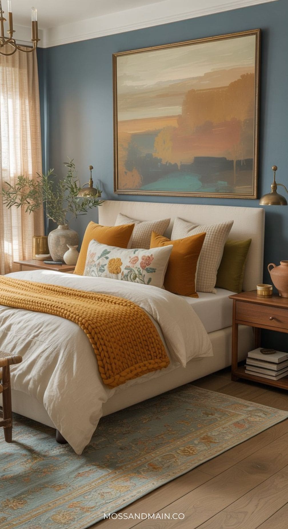
A single teal accent wall behind the bed creates architectural interest without overwhelming the room. Against creamy neutral walls and warm linen bedding, this single moment of saturated color feels dramatic and intentional. Mustard enters as a velvet lumbar pillow and a woven throw. Aged brass wall sconces flank the bed for symmetry and warmth.
Bedroom #2 | Dusty Blue and Mustard Bedroom
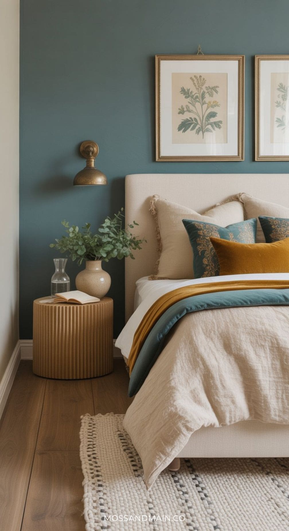
This is the most liveable version of the palette in a bedroom — cozy, sophisticated, easy to sleep in.
Bedroom #3 | Earthy Dreams: Ochre Bedroom Walls + Dusty Blue Bedding
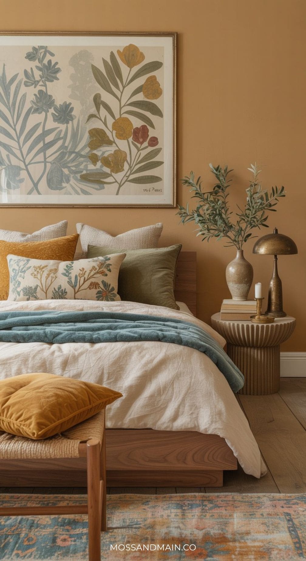
Flip the formula: warm ochre walls wrap the bedroom in a cocooning warmth, while dusty blue bedding and textiles introduce the cooling contrast. Walnut furniture grounds the palette, and olive green appears in a potted plant or a single accent throw. This version feels particularly connected to nature — like sleeping inside a landscape painting. Ideal for north-facing rooms that need warmth.
Loving the mustard / ochre walls? We have more for you! Click to see 30+ Mustard Yellow Bedroom Ideas and Decor Ideas.
Here’s another example with slightly darker ochre walls…
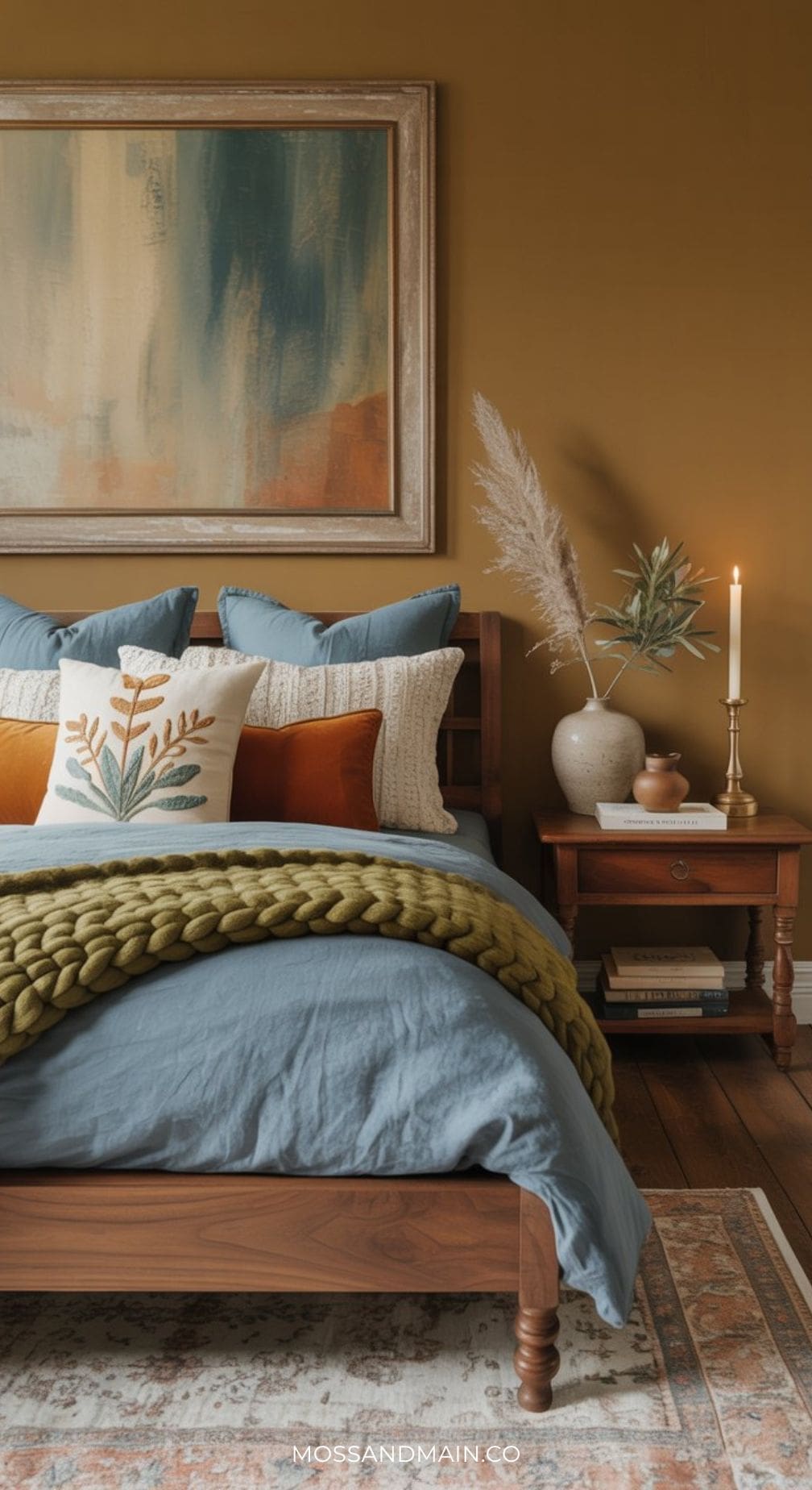
Bedroom #4 | Soft & Romantic: Neutral Base, Both Colors as Accents
For those who want the palette without committing to a bold wall color, this approach lets the neutrals take the lead. Creamy walls, linen bedding in off-white, and a natural jute rug create a serene canvas. Dusty teal and mustard appear as deliberate accents — a teal throw pillow here, a mustard velvet chair there, an aged brass lamp, a small botanical print. The effect is romantic, soft, and layered — with just enough color to feel designed.
Kitchen & Beyond
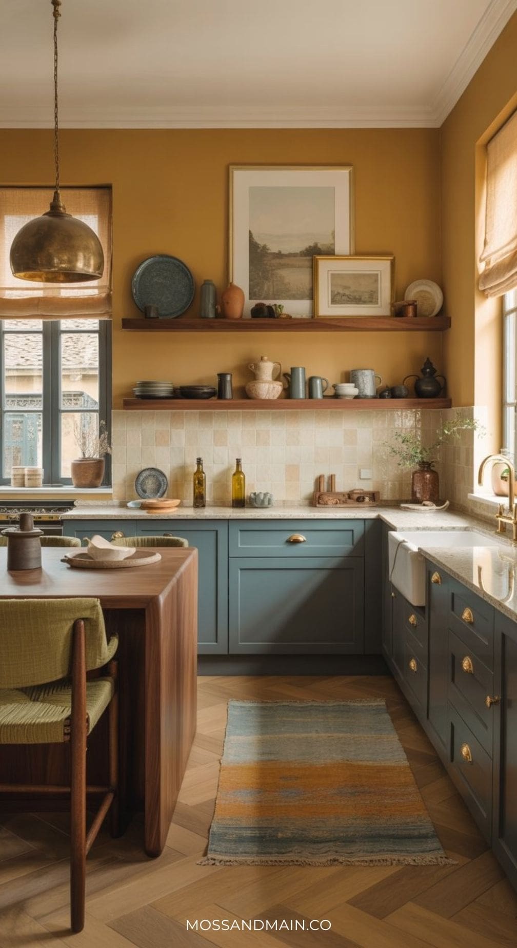
Kitchen #1 | The Hero Kitchen: Soft Teal Blue Cabinetry + Brass + Mustard Tile
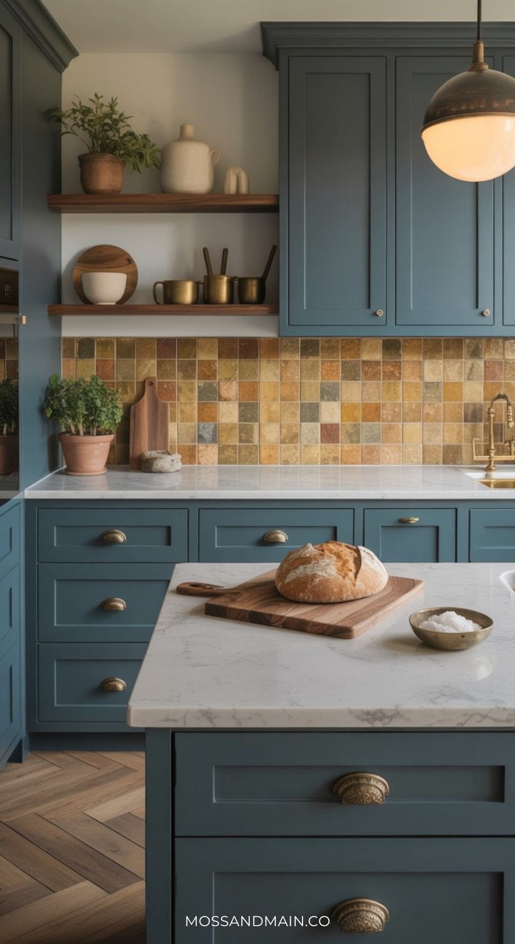
Teal inset Shaker cabinetry paired with warm cream or quartzite countertops, a handmade Zellige tile backsplash in mustard or terracotta tones, and unlacquered brass hardware. Walnut open shelves add warmth overhead, and carefully styled ceramics and potted herbs complete the lived-in quality. A kitchen that looks like it belongs in an Architectural Digest feature.
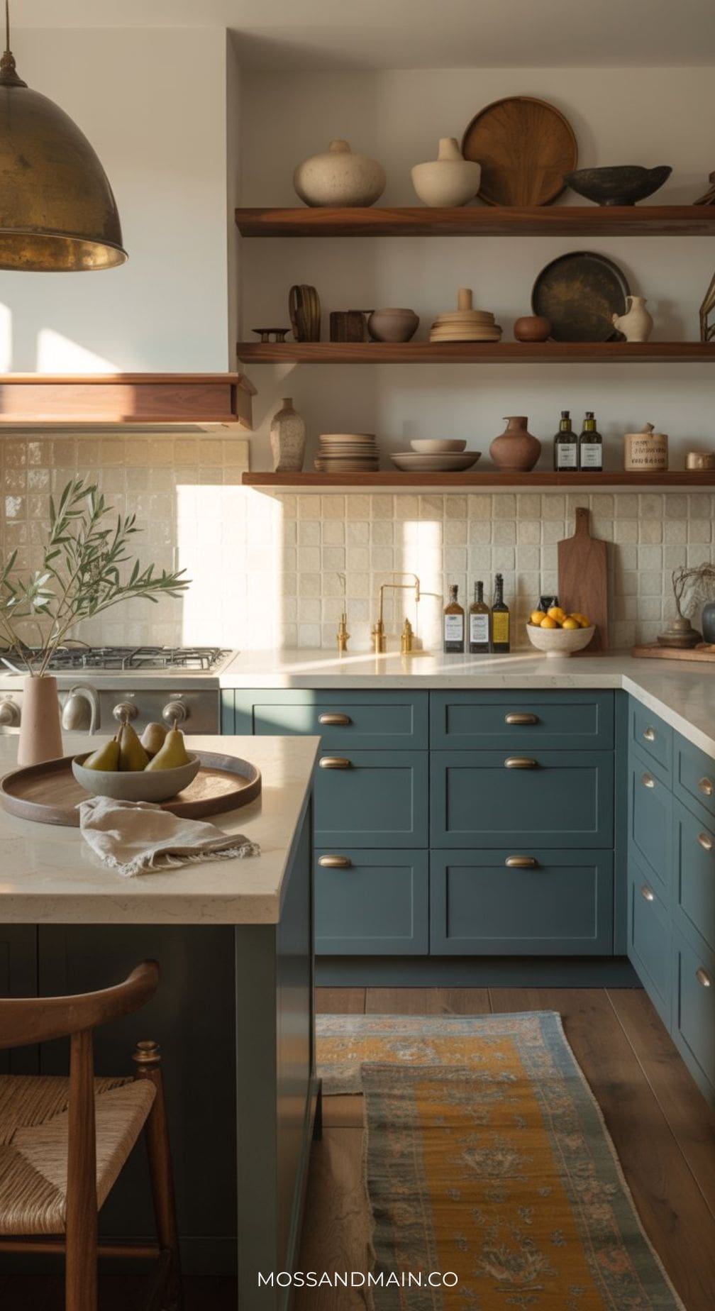
Kitchen #2 | Open Shelving Styling in the Blue and Mustard Color Scheme
Open shelving is one of the most Pinterest-searched kitchen details — and it’s the perfect opportunity to bring the blue and mustard palette into a kitchen without a major renovation. Style walnut shelves against a dusty teal or creamy neutral wall with a curated mix of cream stoneware, mustard-glazed pottery, teal linen tea towels, brass objects, and potted herbs. The key is restraint: every item should be intentional, nothing purely utilitarian.
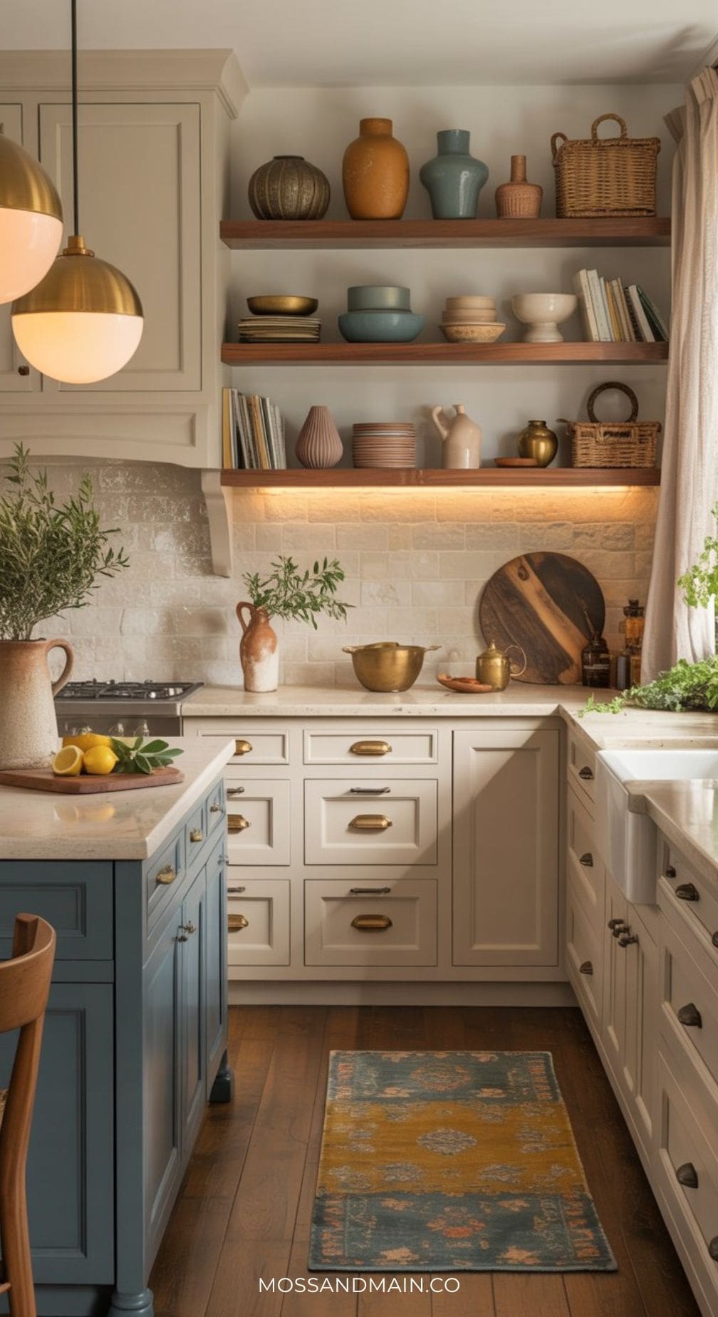
Kitchen #3 | Mustard Kitchen Walls with Modern Organic Charm
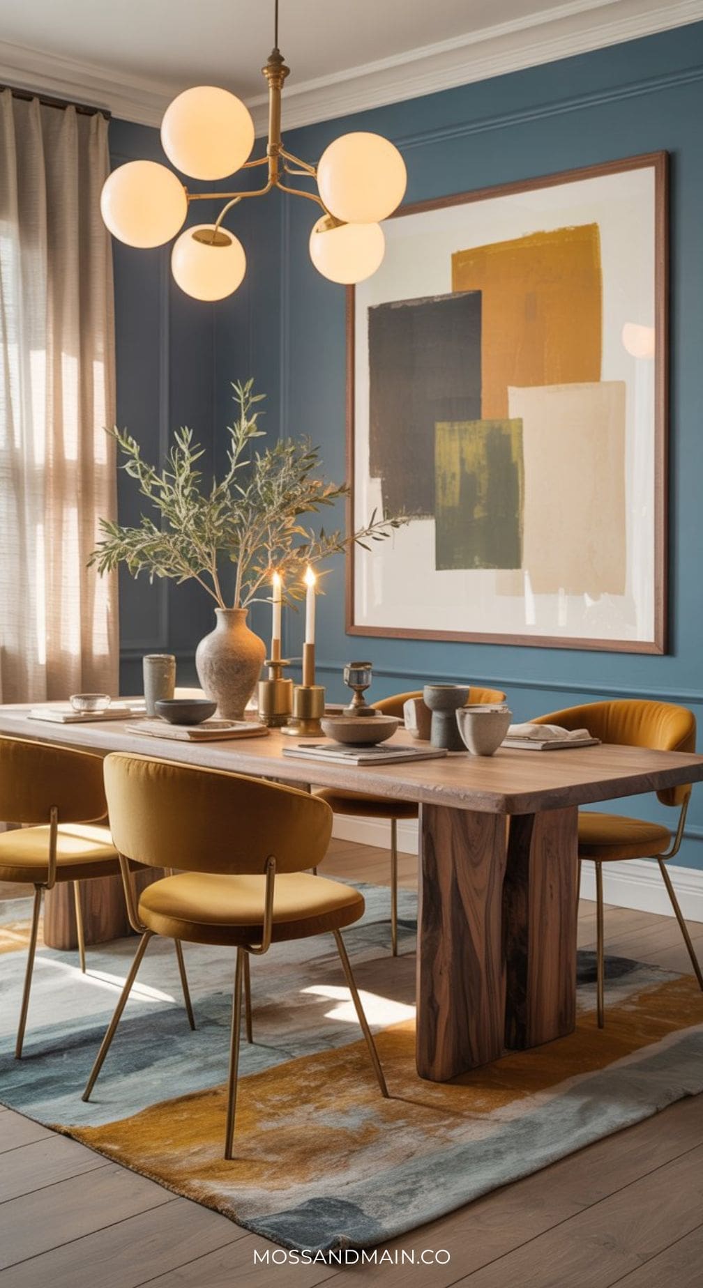
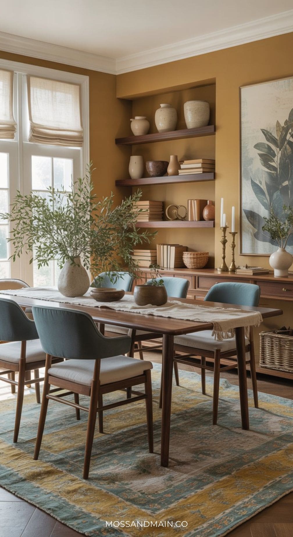
Dining Room with Dusty Blue Walls
For more dusty blue dining room designs and inspo, don’t miss Blue Dining Room Ideas: The Complete Guide to Every Shade
Dining Room with Deep Mustard / Ochre Walls
Dusty Blue Entryway #1
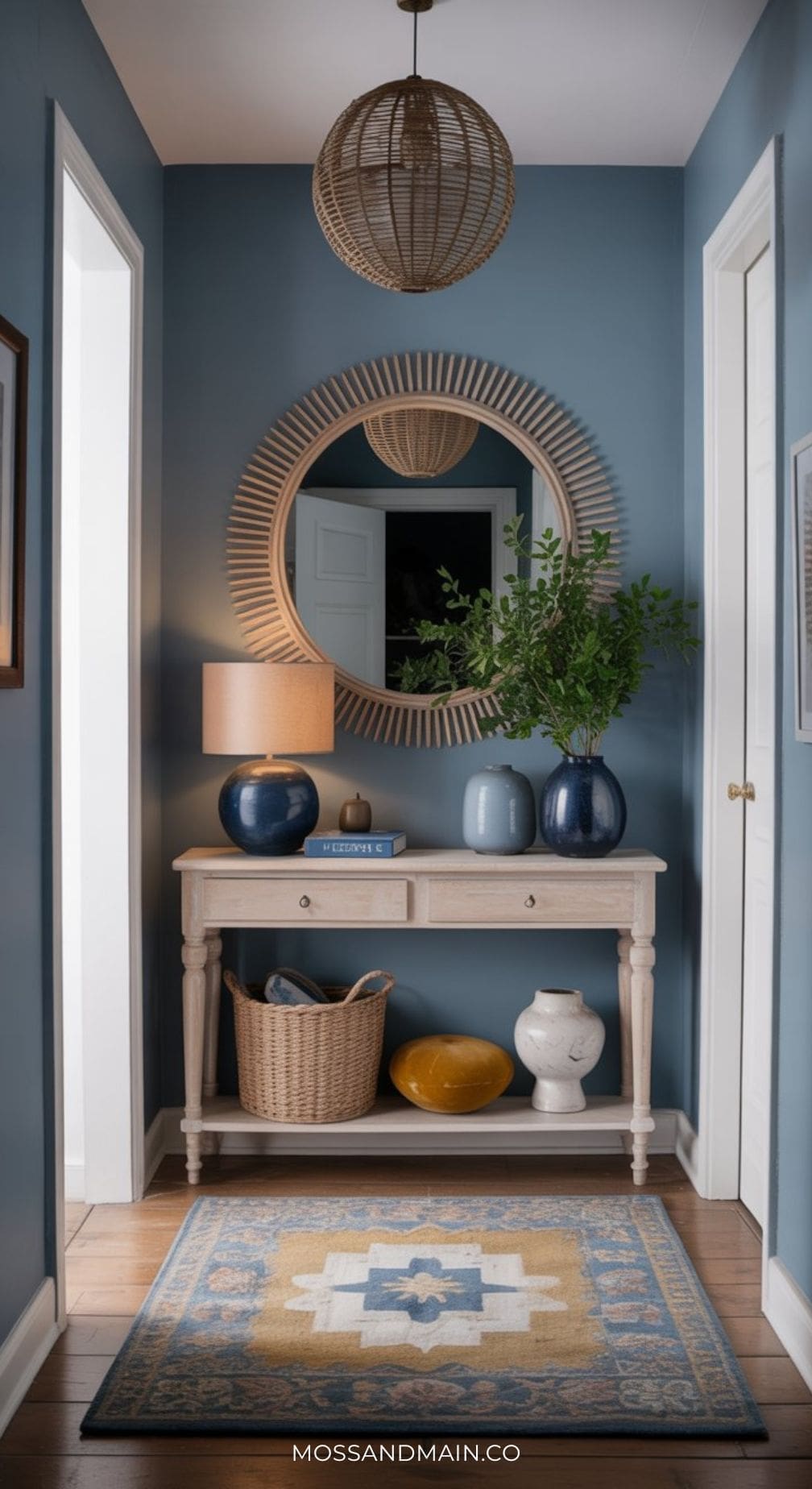
Dusty Blue Entryway #2
How to Get This Look With White Walls
For Renters & Paint-Shy Decorators
Here’s the truth most decorating guides don’t tell you: white walls are not a limitation. They’re a blank canvas — and for this palette specifically, they’re actually one of the best possible starting points. Creamy neutral is already part of the blue and mustard color family. Plain white walls simply mean the color has to work harder in every other layer of the room — and when it does, the effect is just as intentional, just as designer, and completely renter-friendly.
1. Let Your Sofa or Bed Be the Blue
When the walls are white, your largest furniture piece takes on the job the wall color would normally do. A dusty teal velvet sofa or an upholstered teal headboard instantly anchors the whole palette and becomes the visual centerpiece of the room. Against white walls, that pop of color reads even more boldly — so you actually get more impact, not less. In a bedroom, teal bedding in a heavy linen or stonewashed cotton achieves the same effect for a fraction of the cost.
2. Go Big With a Rug
A large area rug is the single most powerful decorating tool in a renter’s toolkit — and in this palette, it’s non-negotiable. Look for a vintage-style or hand-knotted wool rug that carries all three tones: dusty teal, warm mustard or rust, and cream. This one piece does the work of an entire painted room because it grounds the seating area in color, adds texture underfoot, and ties every other element together visually. Size matters: always go bigger than you think you need. A 9×12 in a living room, an 8×10 under a queen bed.
3. Use Large-Scale Art as Your Accent Wall
A large framed print or canvas hung over your sofa or bed functions exactly like a painted accent wall — it fills the visual field with color and creates the same anchoring effect. For this palette, look for a botanical print, abstract watercolor, or vintage map that prominently features dusty teal and mustard or ochre tones against a cream background. Go as large as the wall will allow: a 24×36 minimum in a living room, ideally 30×40 or larger. Lean it against the wall if you can’t hang it. The effect is the same.
4. Pile On the Textiles
White walls actually demand more layering in your soft furnishings — which works entirely in your favor here. Throw pillows in mustard velvet, dusty teal linen, and a botanical-print fabric all stacked on a neutral sofa look rich and intentional. A chunky knit throw in olive green draped over an armchair. Linen curtains in creamy white or warm oatmeal that pool slightly at the floor. Every textile is doing double duty: adding color to the room and softening the visual impact of the white walls behind it.
5. Let Brass Do the Heavy Lifting
Against white walls, aged brass becomes even more impactful. A large brass arc floor lamp, a cluster of brass-framed mirrors, a brass and cane bar cart — these pieces introduce warmth and visual weight that white walls alone can’t provide. They connect directly to the mustard/ochre tones in the palette, so they feel like a deliberate design choice rather than a workaround. Swap out chrome or nickel light fixtures for aged brass versions (most are just a matter of unscrewing the canopy — fully renter-approved) and the whole room shifts.
6. Bring in Dark Wood to Warm the White
The cooler and starker white walls feel, the more you need warm walnut wood tones to counteract them. A walnut coffee table, a dark wood bookshelf, a rattan-backed dining chair — these elements ground the room and prevent the white walls from reading as cold or clinical. In the blue and mustard palette, walnut acts as the warm earth tone that connects the floor to the rest of the room and makes everything above it feel cozy rather than stark.
✦ The Renter’s Checklist: Blue & Mustard on White Walls
- One large vintage-style rug in teal, mustard, and cream tones (9×12 or larger)
- One large-scale botanical or abstract print in dusty teal and mustard tones, hung above sofa or bed
- Dusty teal as your sofa color, headboard, or dominant bedding color
- Mustard as throw pillows, a single accent chair, or a woven throw blanket
- Aged brass lighting: arc floor lamp, table lamp, or renter-swap pendant fixture
- Walnut or dark wood furniture: coffee table, nightstand, bookshelf, or media console
- Olive green as a small accent: one throw blanket, a potted plant, or a single ceramic piece
- Linen or cotton curtains in creamy white or warm oatmeal, floor-length
Renter’s Look — White Walls + Blue & Mustard Layers
The Styling Cheat Sheet
Use this quick-reference guide to build your perfect blue and mustard room combination:
| Wall Color | Sofa / Bed | Accent 1 | Accent 2 | Metal Finish |
|---|---|---|---|---|
| Dusty Teal walls | Cream linen | Mustard velvet pillows | Olive green throw | Aged brass |
| Creamy Neutral walls | Teal velvet sofa | Mustard rug | Walnut wood accents | Unlacquered brass |
| Warm Mustard walls | Navy blue sofa | Creamy cushions | Olive green plant | Antique bronze |
| Creamy Neutral walls | Linen bedding | Teal headboard wall | Mustard lumbar pillow | Aged brass sconces |
| Dusty Teal cabinetry | Creamy countertop | Mustard tile backsplash | Walnut open shelves | Knurled brass pulls |
Blue + Mustard Paint Color Guide
Knowing the palette is one thing — knowing the specific paint code to bring home is another. Below are the best Sherwin-Williams and Benjamin Moore options for every colour in this palette, organised by family so you can shop with confidence.
Blues — Dusty Teal
Tame Teal
Sherwin-Williams SW 6757
Dusty TealThe closest Sherwin-Williams match to this palette’s signature tone. Muted, earthy, and versatile — works beautifully on walls, cabinetry, and built-ins alike.
Aegean Teal
Benjamin Moore 2136-40
Dusty TealBenjamin Moore’s most-pinned teal — and for good reason. Slightly more grey than SW Tame Teal, which gives it a sophisticated, almost aged quality on large walls.
Rainstorm
Sherwin-Williams SW 6230
Deeper TealA richer, slightly darker teal with a slate-grey undertone. Ideal when you want more drama — especially for cabinetry or a moody headboard accent wall.
Blues — Navy & Slate
Salty Dog
Sherwin-Williams SW 9177
Bold NavySherwin-Williams’ go-to deep navy for living rooms and kitchen cabinets. Rich and anchoring without tipping into black — pairs brilliantly with mustard and brass.
Van Deusen Blue
Benjamin Moore HC-156
Bold NavyA complex navy with subtle grey and teal undertones that shift beautifully through the day. One of the most versatile blues Benjamin Moore makes — and it loves mustard and walnut.
Smoky Blue
Sherwin-Williams SW 7604
Slate BlueA sophisticated blue-grey that reads calm and collected. A designer favourite specifically because it pairs so naturally with mustard yellow and aged bronze tones.
Newburyport Blue
Benjamin Moore HC-155
Slate BlueSlightly lighter than Van Deusen — a fresh, classic shade that works beautifully in bedrooms and any space where you want navy without the full visual weight.
Mustard, Ochre & Gold
Nugget
Sherwin-Williams SW 6697
Warm MustardA rich, golden-mustard that feels sunny without being overwhelming. Beautiful on accent walls and cabinetry — especially when paired with dusty teal and walnut wood tones.
Gambol Gold
Sherwin-Williams SW 6690
Deep MustardDeeper and more muted than Nugget — a richer, more grown-up version of mustard gold. Excellent for a full room or a dramatic accent wall.
Hathaway Gold
Benjamin Moore 194
Deep MustardA full-bodied deep mustard from Benjamin Moore — particularly wonderful on dining room walls and kitchen cabinets. Pairs beautifully with walnut and deep olive green.
Marblehead Gold
Benjamin Moore HC-11
Warm OchreBenjamin Moore’s most versatile gold — richer and more ochre-toned than Hathaway. A whole-room colour that wraps a space in warmth without feeling heavy.
Creamy Neutrals — Trim & Background Walls
Alabaster
Sherwin-Williams SW 7008
Creamy WhiteSherwin-Williams’ most-loved warm white. The ideal trim and ceiling colour for every variation of this palette — never cold or stark against teal or mustard walls.
White Dove
Benjamin Moore OC-17
Creamy WhiteBenjamin Moore’s benchmark warm white for trim and walls. Soft, clean, and creamy — beautiful as trim against any blue in this palette.
Accessible Beige
Sherwin-Williams SW 7036
Warm GreigeA warm greige that works as the 60% dominant neutral when you want more warmth than white walls. Perfect for letting teal furniture and mustard accents do the talking.
PRO TIP: Always sample before you commit. Both Sherwin-Williams and Benjamin Moore offer peel-and-stick paint samples — or try Samplize for any brand delivered overnight. Live with your chosen swatch on the actual wall for at least 48 hours and check it in morning light, bright afternoon sun, and evening lamplight before buying a full gallon. Blues and mustards are both highly sensitive to light conditions and can shift significantly from morning to night.
How to Start Small
You don’t need to repaint a wall to try this palette. The fastest way to test it in your home is with textiles first: one mustard velvet throw pillow on your existing sofa, a dusty teal woven blanket on your bed. If you love how those pieces make you feel in the space after two weeks, that’s your answer. Then layer in a piece of art, then a lamp, then think about wall color. The palette builds naturally — and every step of the way, it feels considered.
The blue and mustard palette isn’t a trend. It’s a timeless framework for building a home that feels warm, layered, and genuinely yours — whether you’re starting with white rental walls or going all-in on a full room transformation.
— Moss & Main —
Earthy. Elevated. Effortlessly Cozy.
Please note: This website contains affiliate links. As an Amazon Associate, we earn from qualifying purchases at no additional cost to you.